
At this stage of the project, I had already built a working sensor network and a data logging system that could receive, parse, and store data from multiple onboard modules. The next logical step was to make that data visible in real time.
This meant designing and building a dashboard—not just a visual interface, but a system that could consume fused sensor data and present only what actually mattered to the rider.
Backend Data Fusion and Frontend
One of the first design decisions I made was to separate responsibilities:
- the backend would collect, parse, and fuse sensor data
- the frontend would request that data and render it
The data logging engine was already:
- receiving sensor data wirelessly
- parsing incoming packets
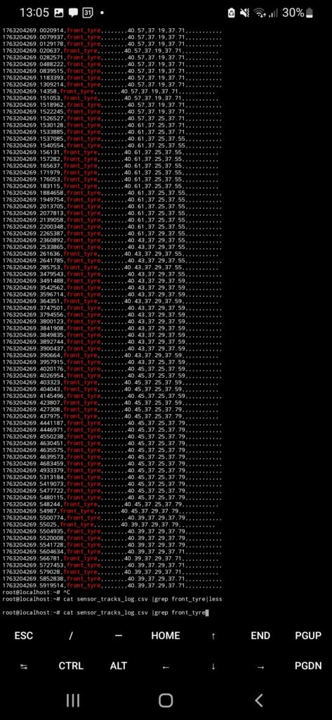
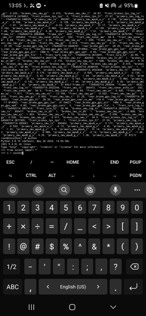
- storing logs in JSONL format
What was missing was a real-time access layer for the dashboard.
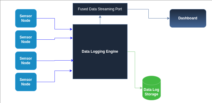
Exposing fused data over UDP
To solve this, I added a dedicated UDP socket to the data logging engine.
This socket had a very specific role:
- expose the current fused data frame
- allow any client to request that data on demand
The logic was intentionally simple:
- a client sends a
REQmessage - the logging engine responds with one aggregated data frame
- the frame contains the latest values from all active sensors
This same port could be used by:
- the dashboard frontend
- a laptop for debugging
- a Jupyter Notebook session
I chose UDP over TCP because it is connectionless. There’s no session state to manage, and clients can connect or disconnect freely without additional logic. For stateless, on-demand data streaming, UDP was a better fit.
Conceptualizing , Design and Implementation
Before writing any dashboard code, I needed to answer a harder question:
What should the dashboard actually show?
A dashboard can look impressive and still be unusable in practice. A visually “cool” dashboard is not automatically a practical one.
The rider needs to:
- understand information at a glance
- avoid distraction
- see the most important signals clearly
This meant resisting the temptation to display everything.
Drawing Ideas and Inspiration
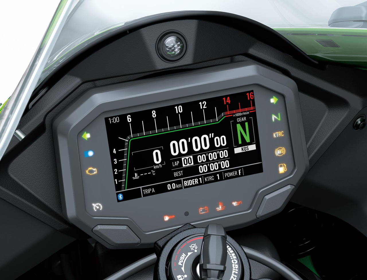
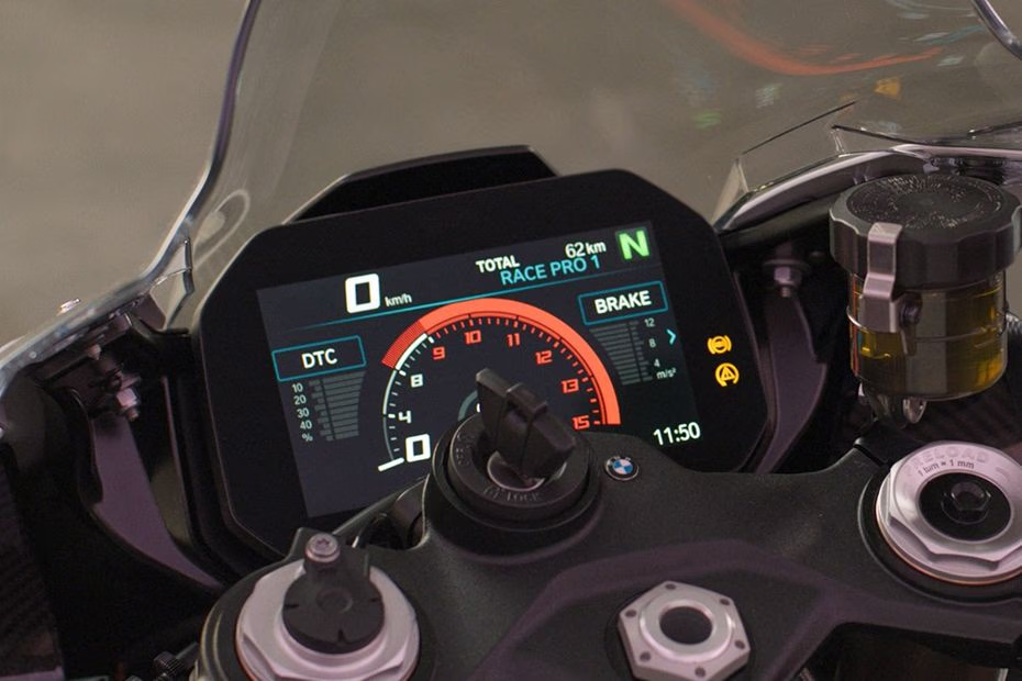
To ground my design decisions, I studied dashboards from several manufacturers:
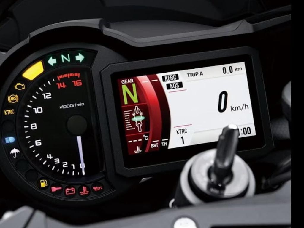
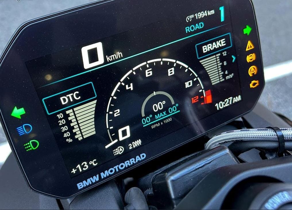
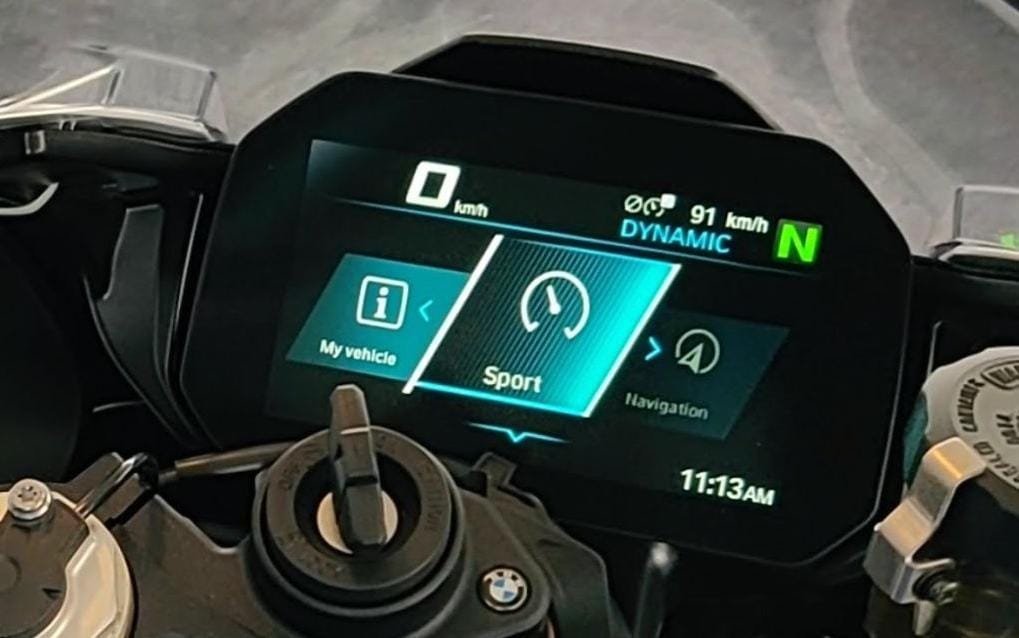
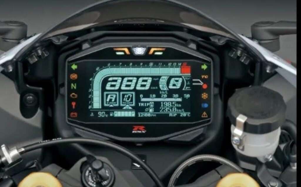
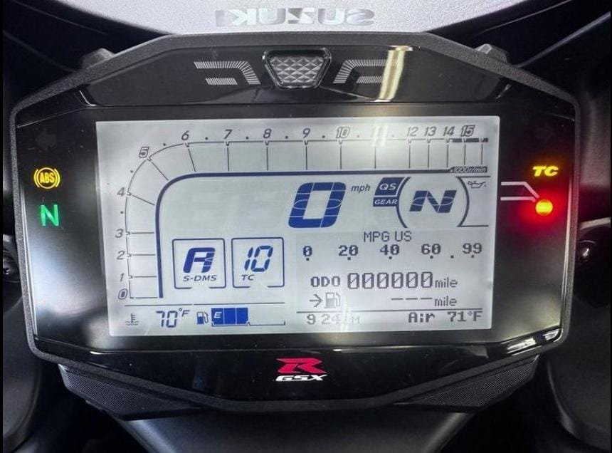
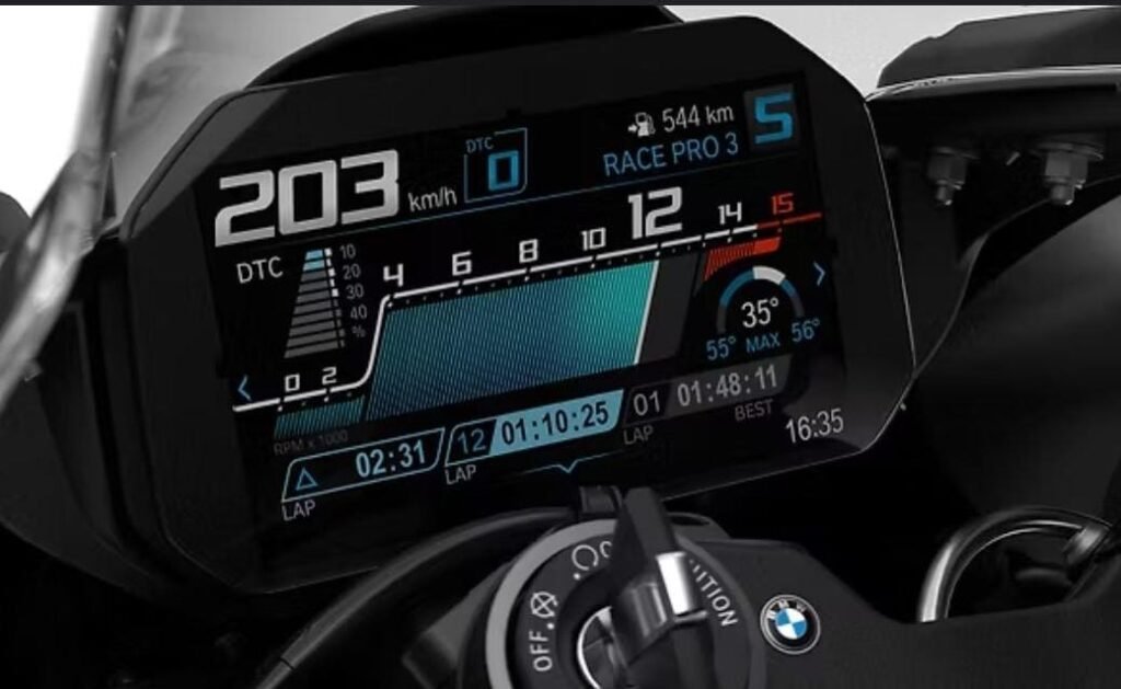
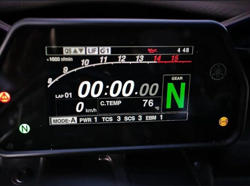
The BMW S1000RR dashboard stood out in particular. Its layout felt balanced, readable, and intentional. Information was grouped logically, colors were restrained, and nothing felt oversized or cluttered.
It became a strong reference point for what good dashboard design looks like.
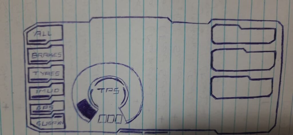
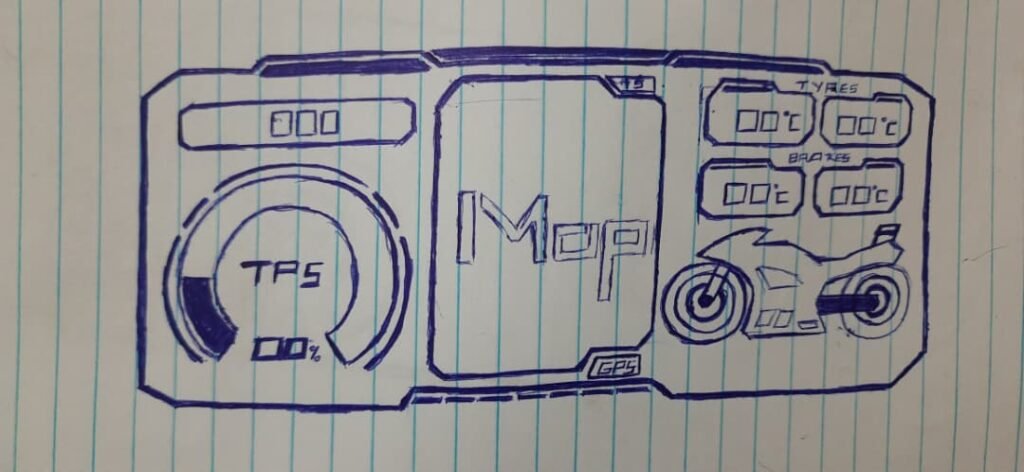
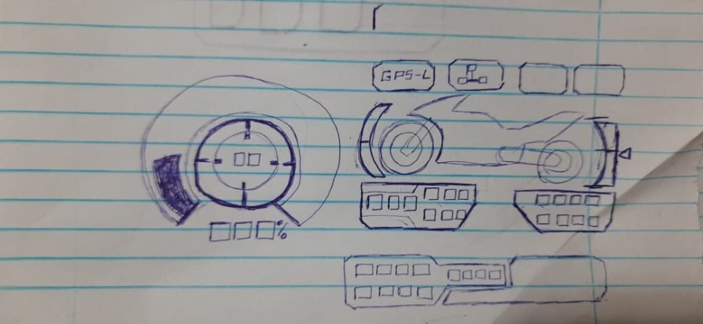
Sketching and planning the dashboard layout
With references in mind, I started sketching dashboard layouts.
At this stage, the goal wasn’t aesthetics—it was information hierarchy:
- what needs to be central
- what can be secondary
- what can be hidden entirely
I sketched widget placements and experimented with different layouts before committing to any implementation.
Deciding what information actually mattered
Once I had real sensor data flowing, I made a list of everything I could display—and then cut it down.
Some data was better suited for logging and offline analysis rather than real-time display.
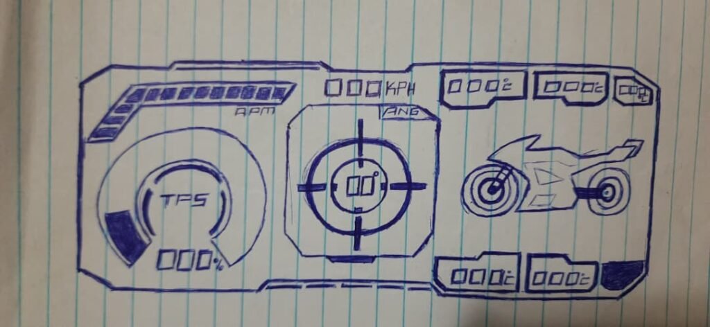
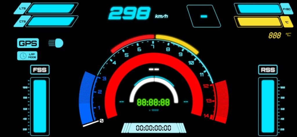
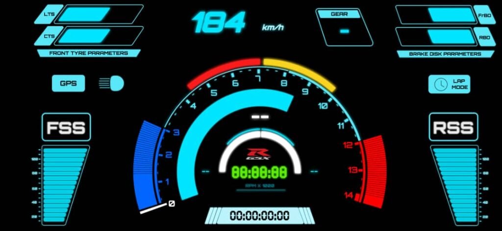
The core information that stayed on the dashboard was:
- speed
- RPM
- gear indicator
- date and time
On top of that, I added:
- tyre temperature indicators
- brake disc temperature indicators
- suspension level indicators
- lap timer
Anything that didn’t clearly help the rider in the moment was removed.
Feature Addition & Substraction
Not everything survived testing.
Some features that were implemented and later removed:
- a shift indicator widget
- early, low-resolution suspension indicators
- a startup “sweep test” animation
The sweep animation looked cool, but:
- it didn’t add functional value
- it introduced unnecessary rendering load
- it caused visible UI jank
This was an important lesson: visual effects can hurt usability and performance.
Managing information density and cognitive load
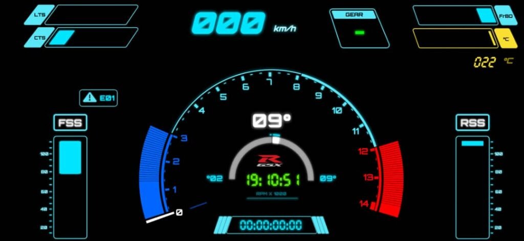
As the dashboard matured, I added:
- headlight indicators
- GPS lock status
- lap mode indicator
- custom sensor error codes
These error codes were not Suzuki ECU errors, but internal diagnostics so I could see which sensor modules were offline or misbehaving.
One important design decision involved lap mode:
- when lap mode is active, the clock is hidden
- when lap mode is disabled, the clock returns
This prevented two time-based widgets from competing for attention.
Iteration taught restraint
Over time, the dashboard became simpler.
Elements that felt important early on were removed after real usage. Each iteration forced a question:
Does this actually help the rider right now?
If the answer was no, it didn’t belong on the screen.
Balancing:
- imagination
- integration
- restraint
turned out to be one of the hardest parts of the project.
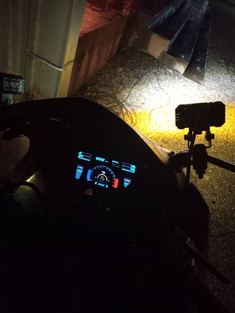
Why this mattered for an older bike
What made this especially satisfying was seeing the dashboard running on a 2003 GSX-R1000.
This bike was never designed to support:
- telemetry
- modern dashboards
- software-driven behavior
Yet with a layered system—sensors, backend fusion, frontend display—it was possible to give it a modern, data-driven interface without touching the ECU.
What this part of the project taught me
Designing the dashboard taught me that:
- presentation matters as much as data
- fewer signals, shown well, beat many signals shown poorly
- dashboards should be opinionated
- integration is as much a design problem as a technical one
It also gave me a new appreciation for how much invisible engineering goes into OEM motorcycle dashboards.