Diagnostics and Error Codes

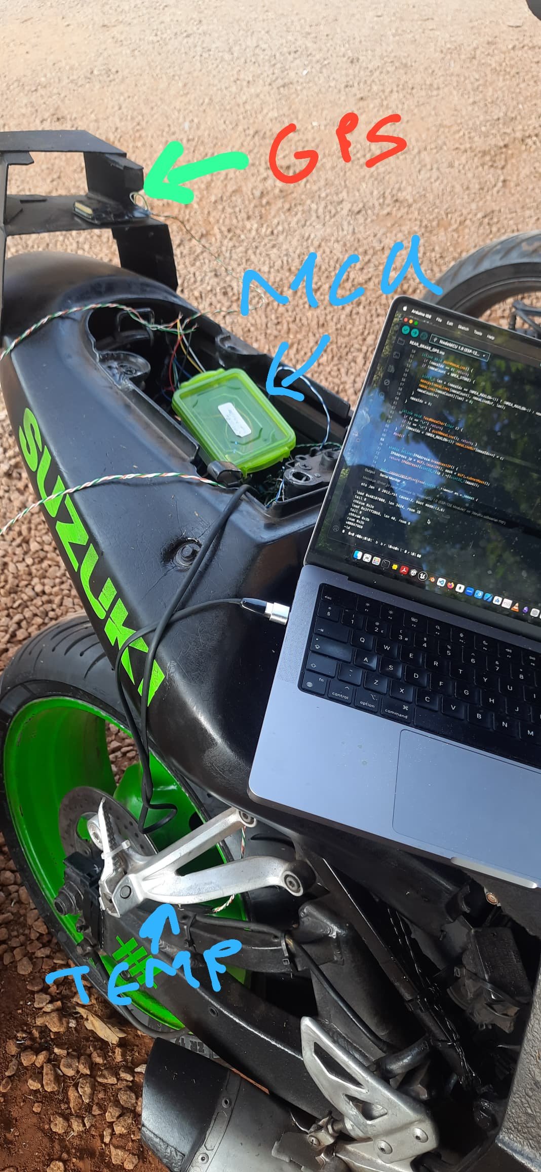
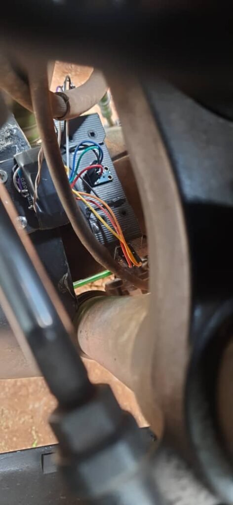
One thing I didn’t expect to learn so quickly in this project was hardware failure.

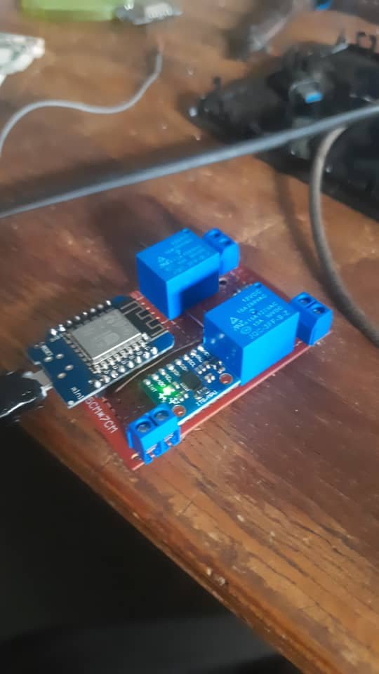
Because my sensor hardware is prototype-grade (cheap modules, improvised mounts, messy environments), I started seeing things like:

  • sensor dropouts mid-ride
  • modules rebooting randomly
  • packets arriving with missing fields
  • “null” or zero values suddenly appearing
  • data streams going quiet with no warning

And the worst part wasn’t the failure — it was not knowing which subsystem failed without stopping everything and digging through logs.

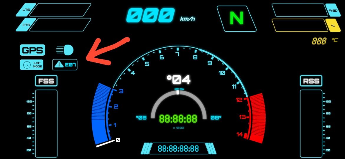
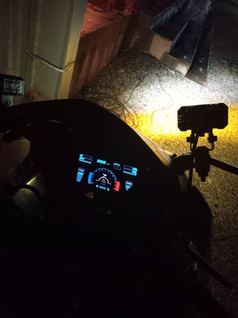
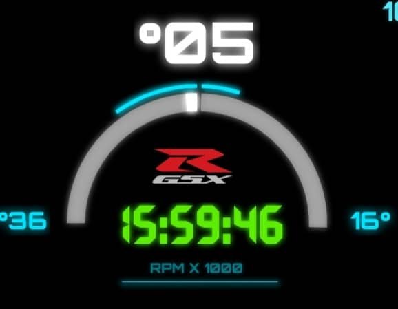
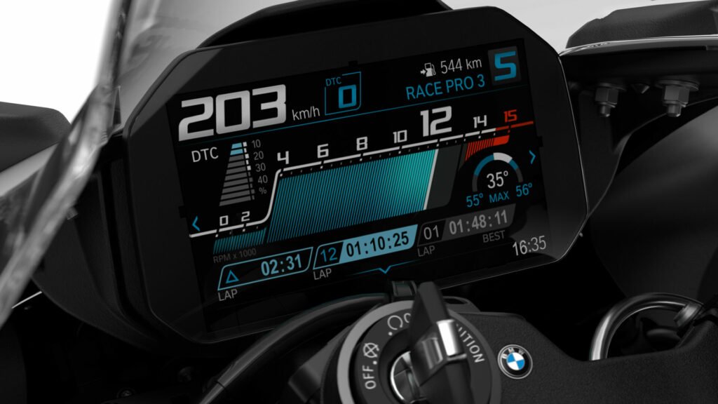
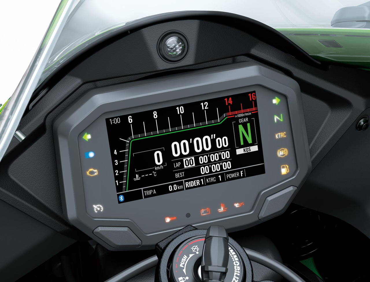
So I built a simple diagnostic layer: an error code system that would tell me, directly on the dashboard, what had stopped responding.


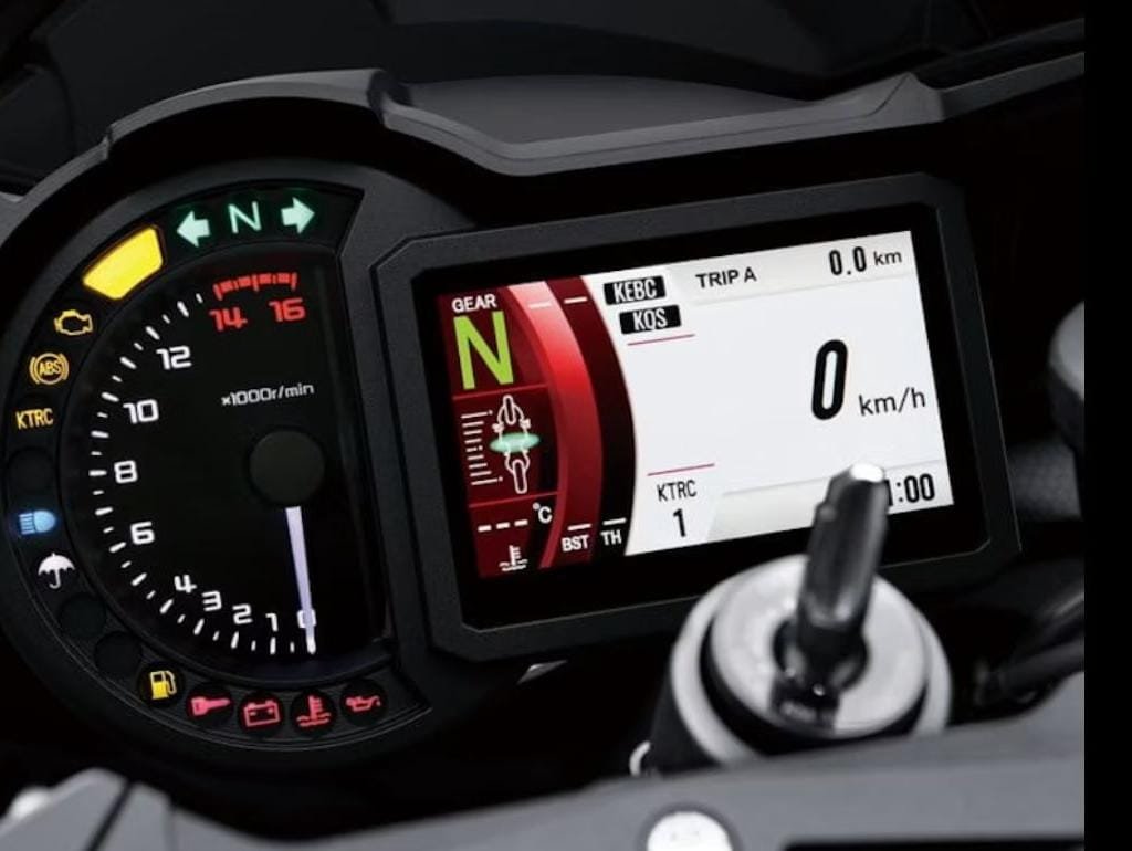
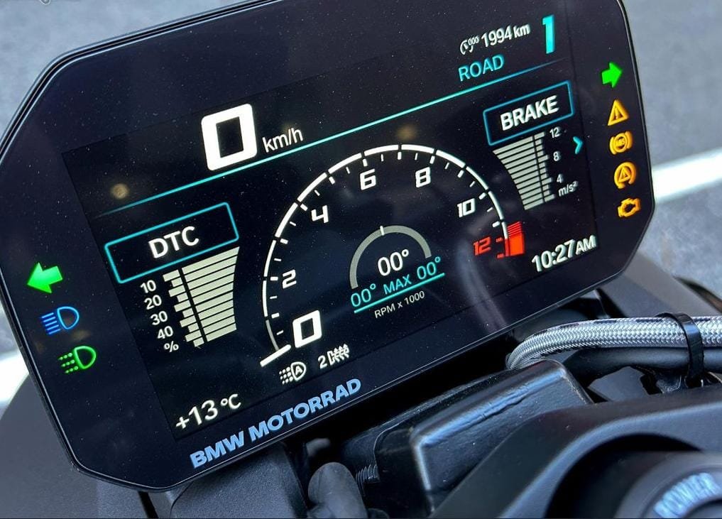
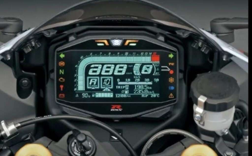
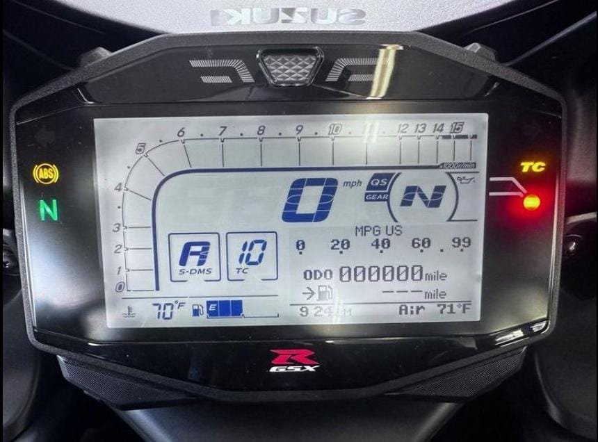
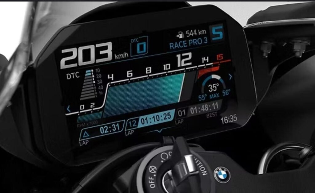
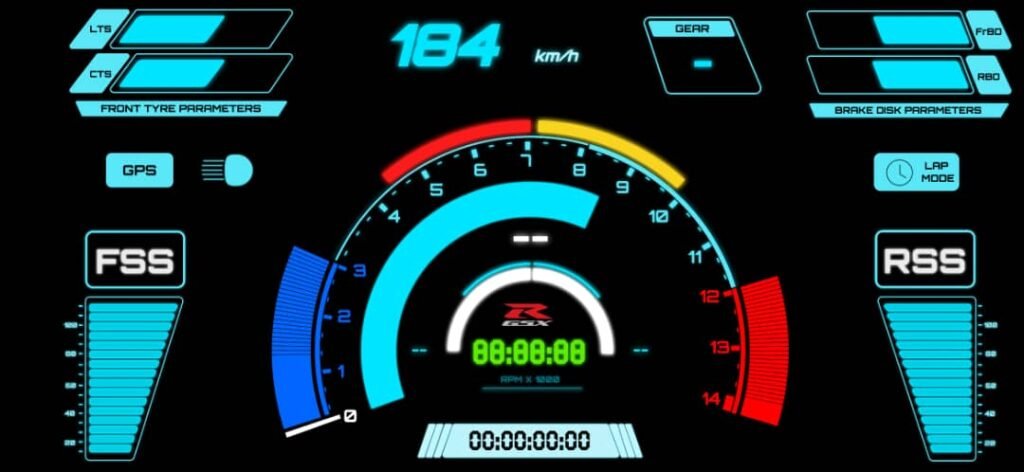
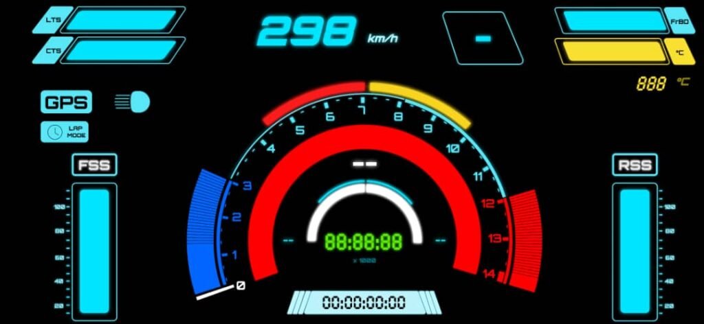
Inspiration: the OEM “dealer mode” style of diagnostics

The idea was inspired by how older bikes expose faults through the dash.

On the 2003 GSX-R1000, you can enter the bike’s diagnostic / dealer mode using the service connector and the dash will display fault codes (or a normal “all good” state). It’s simple but extremely useful: if something is broken, the bike tells you.

I obviously can’t integrate into the OEM ECU diagnostics system — but I can build the same concept for my own sensor network.

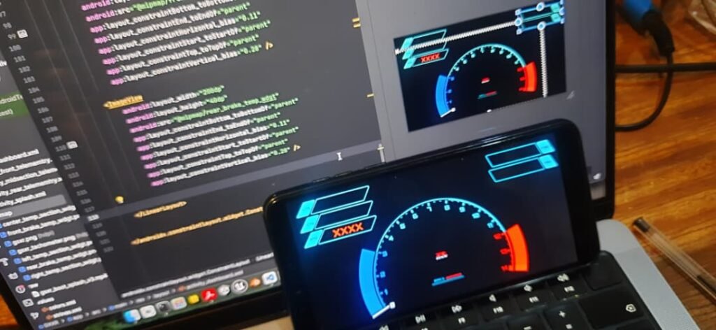
So I did: my custom dashboard would show E-codes that represent failures in my sensor subsystems.


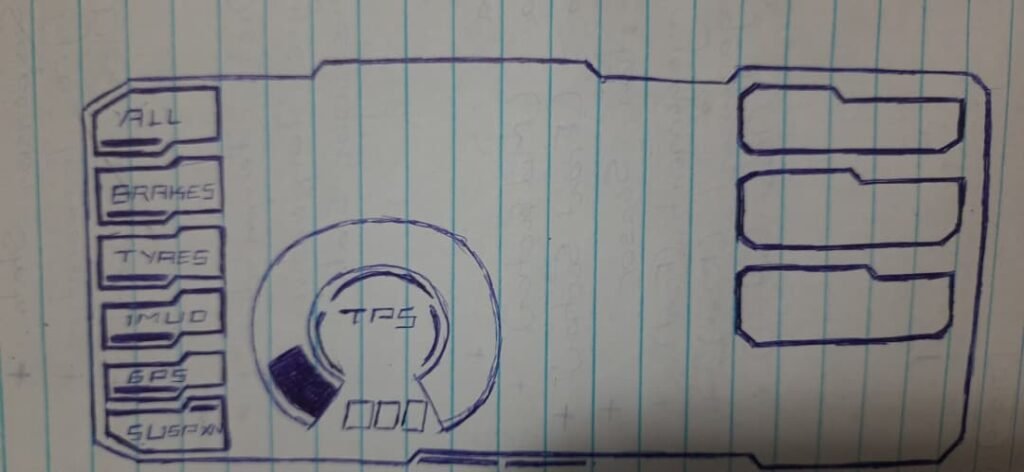
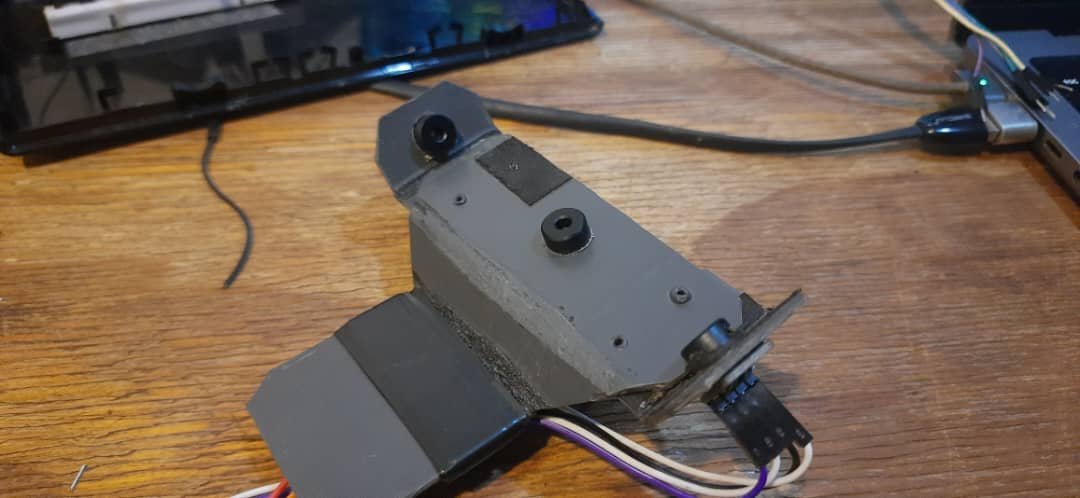
Step 1: Enumerate sensors and define error codes

First I listed every sensor / subsystem I cared about detecting. Then I assigned a simple code format:
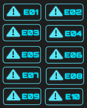
  • E-01 to E-10
  • each code maps to a specific subsystem
  • codes should be readable at a glance
  • codes should be able to show multiple failures in a cycle

This is the mapping I used:

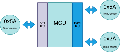
Error Code → Subsystem

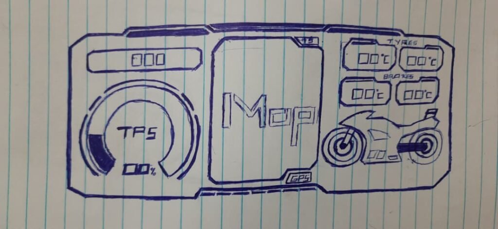
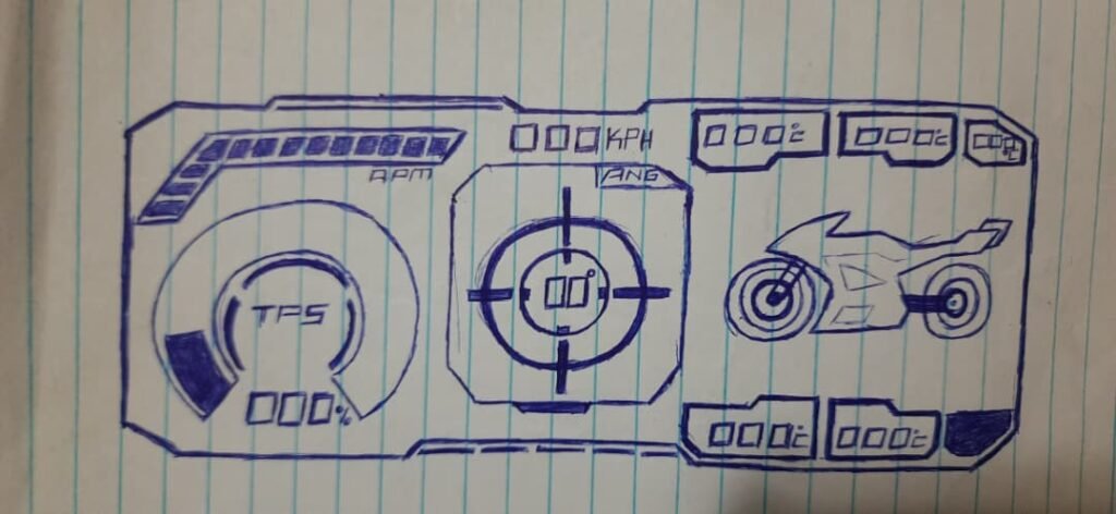
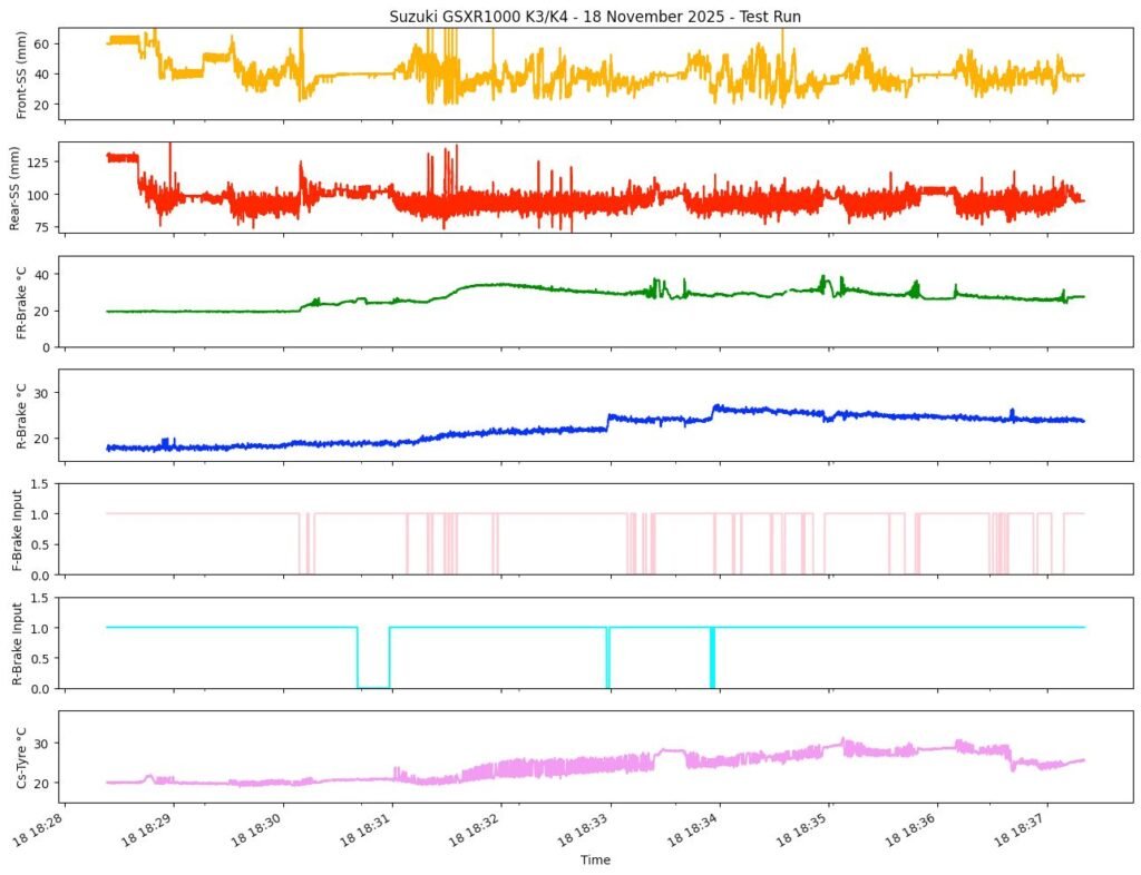
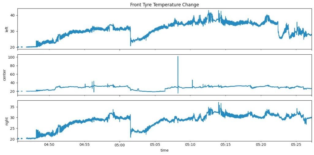
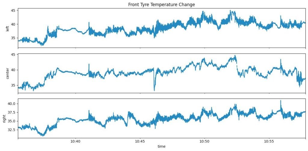
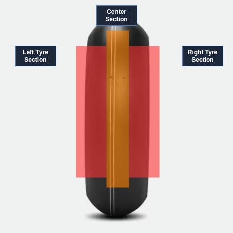
  • E-01 → Left edge front tyre temperature sensor
  • E-02 → Center front tyre temperature sensor
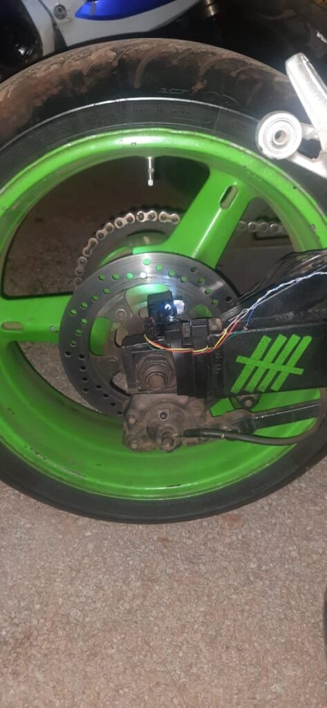
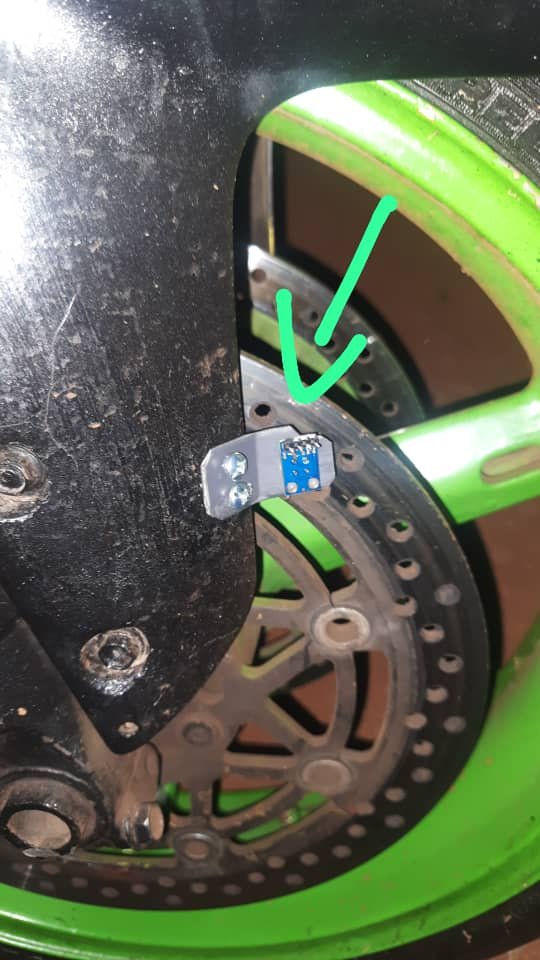
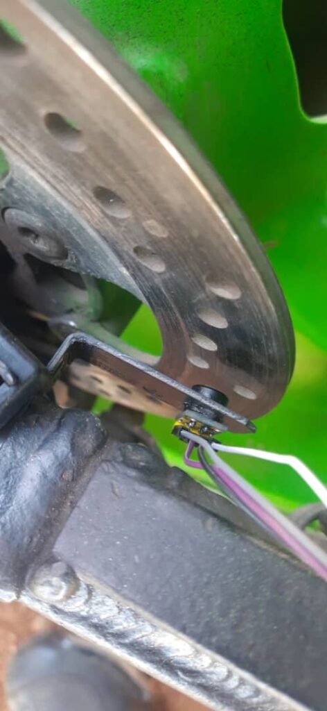
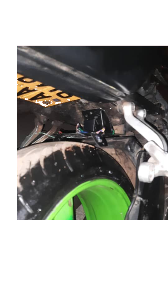
  • E-03 → Left front brake rotor temperature sensor
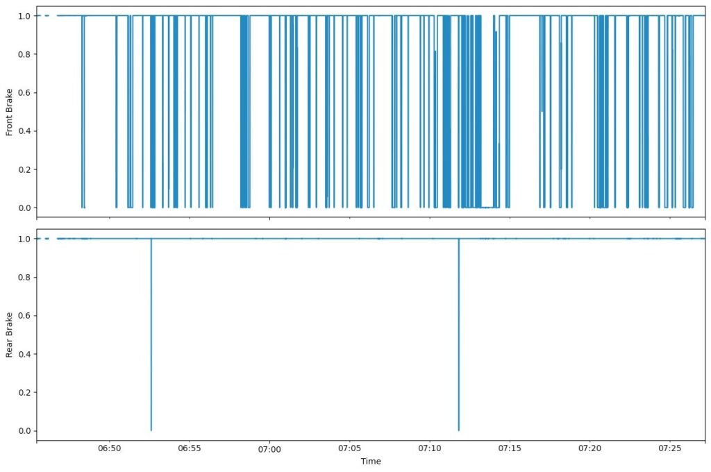
  • E-04 → Brake signal monitoring system (front/rear brake inputs)
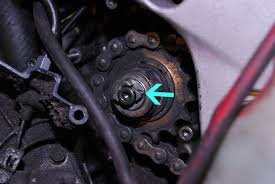
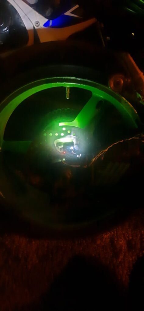
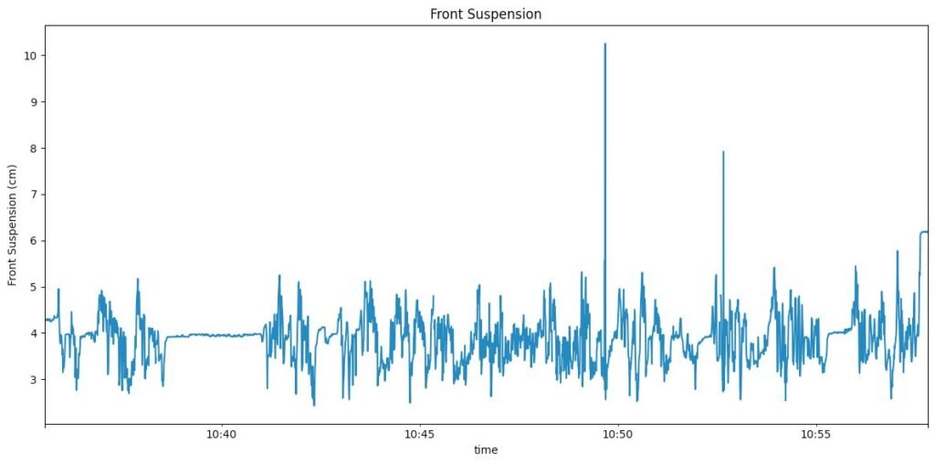
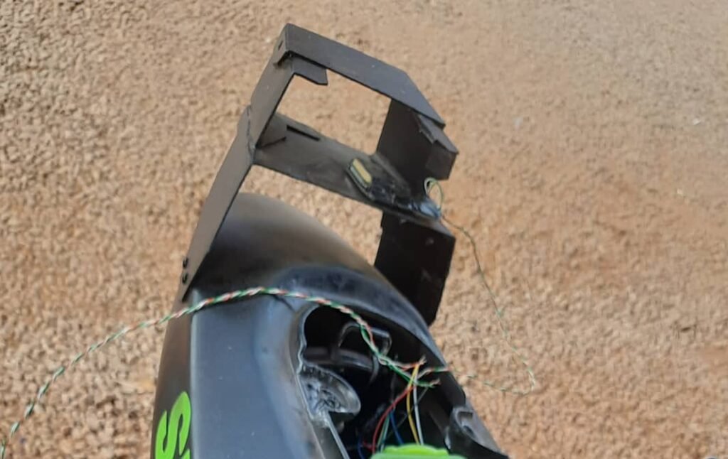
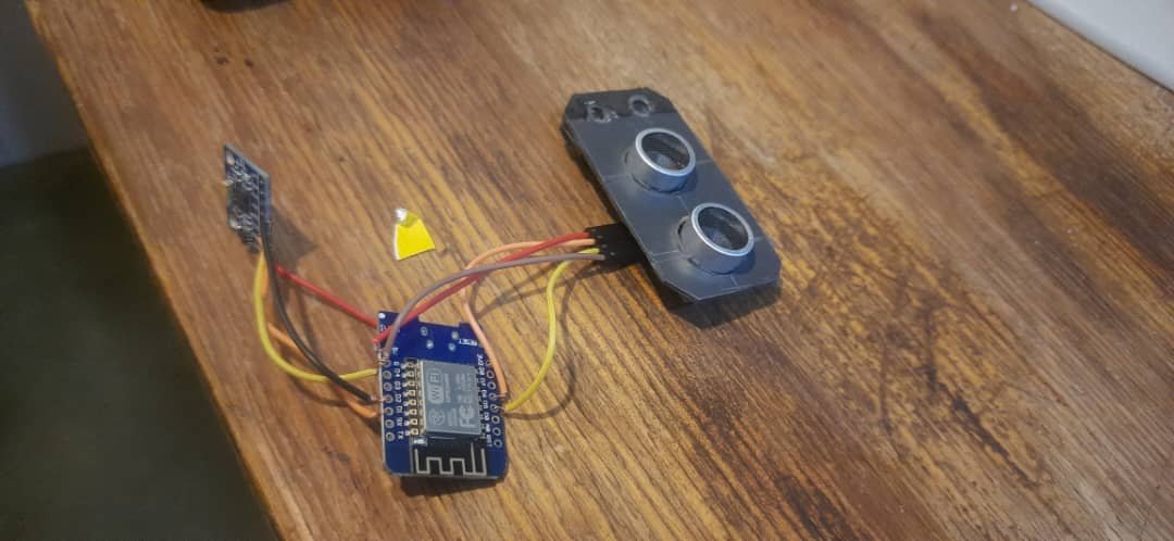
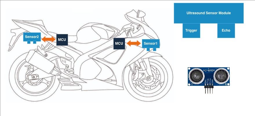
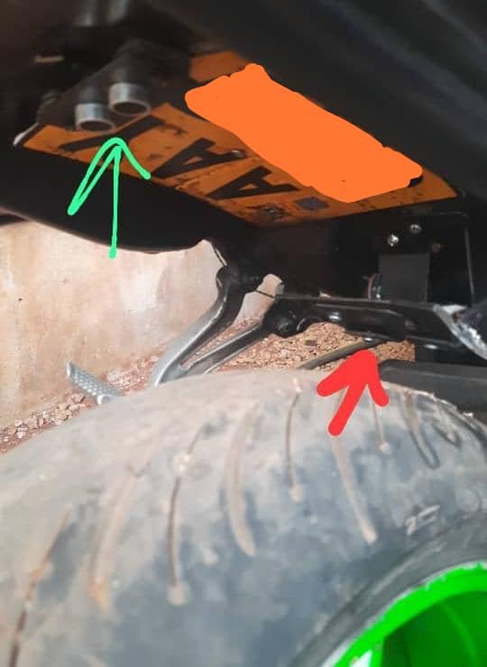
  • E-05 → Front suspension monitoring system (ultrasonic)
  • E-06 → Rear suspension monitoring system (ultrasonic)
  • E-07 → GPS module: fix flag / lock state
  • E-08 → GPS module: speed data stream
  • E-09 → Engine coolant sensor
  • E-10 → Headlight / pass-light switch sensor (used for triggers)

This mapping wasn’t meant to be perfect — it was meant to be useful. I could always expand it later.


Step 2: Decide how to detect a failure

Because this was a prototype, I went for a simple rule:

If a subsystem stops streaming valid data, the dashboard should flag an error code.

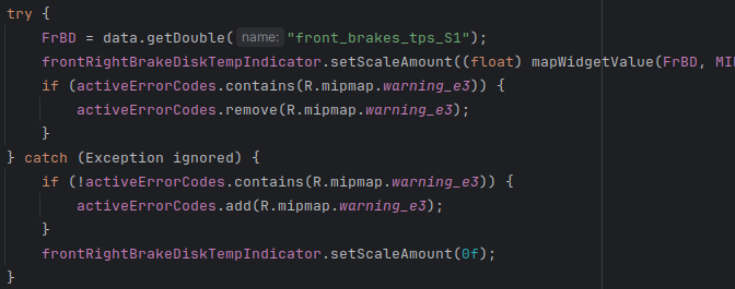
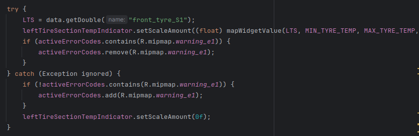
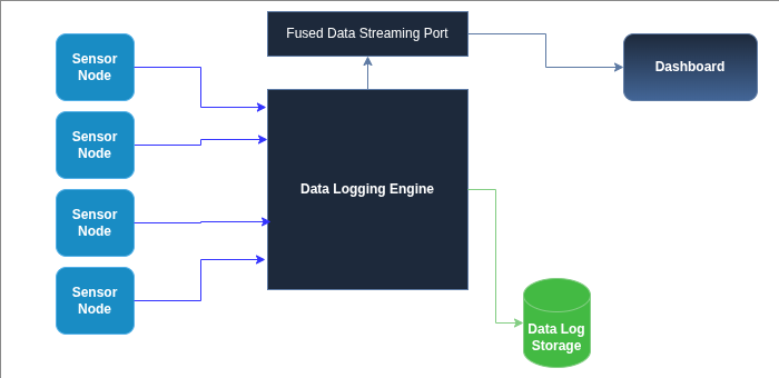
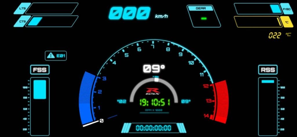
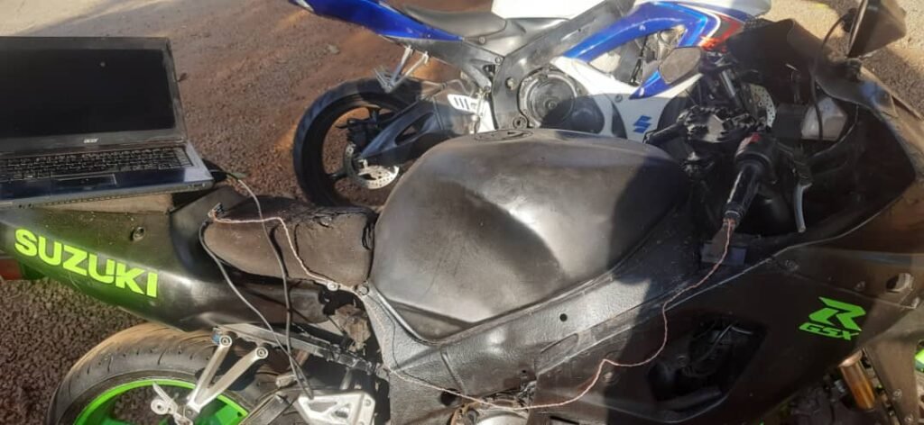
In my implementation, a lot of the failure detection happened while the dashboard was trying to extract values from the fused data object. If the expected field wasn’t present or couldn’t be parsed, it would throw an exception — and I used that as the trigger to mark the subsystem as failed.

This is not the most elegant approach (I’ll explain improvements later), but it worked well enough to expose real failures quickly.


Step 3: Maintain a list of “active” error codes

The dashboard keeps a list of error codes that are currently active.

This list is basically “hot faults” that the UI should display and cycle through.


Step 4: Flag errors when data is missing, clear them when data returns

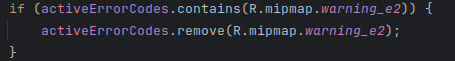
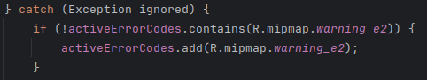
Each sensor widget update loop follows the same pattern:

  • try to fetch a value from the fused data object
  • if successful: update the widget and remove the error code (if it exists)
  • if it fails: add the error code (if it isn’t already active) and blank/reset the widget

This prevents duplicate error codes and keeps the display meaningful.

Here’s an example for the brake disc temperature path:


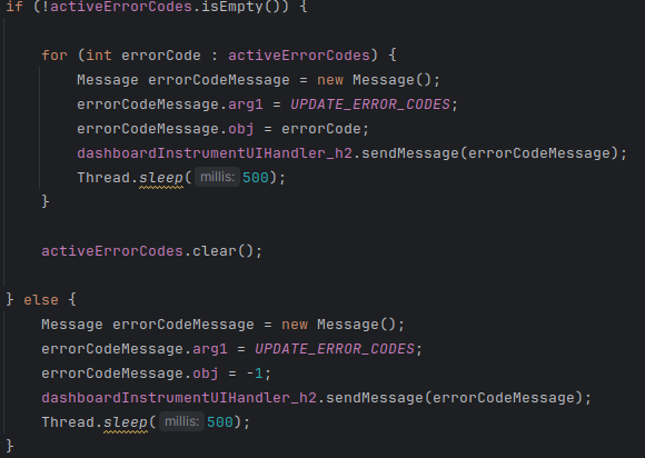
Step 5: Display errors by cycling through active codes

Once errors are in the list, the dashboard needs to show them.

My approach was simple:

  • if there are active errors, cycle through them and display each code briefly
  • after cycling through all codes, clear the list
  • if there are no active errors, send a “clear” signal to the UI

This gave a “flashing code” behavior similar in spirit to OEM diagnostic displays — not the same implementation, but the same idea: multiple failures can be shown, one after another.


Why this mattered more than I expected

This small system ended up being one of the most useful features in the project.

Because sometimes sensors would:

  • drop out temporarily
  • brown out
  • reboot
  • come back online by themselves

If error codes required a dashboard restart to clear, I’d be stuck diagnosing ghosts. Instead, the system clears codes automatically once valid data returns.

That meant I could:

  • identify flaky modules quickly
  • tell the difference between “sensor is dead” and “sensor is rebooting”
  • stop blaming the entire system when only one subsystem was failing

For a prototype system, this was huge.


What I’d improve in a “version 2” diagnostic system

This approach worked, but it has limitations.

If I were rebuilding it more formally, I would improve it in a few ways:

  1. Use timestamps instead of exceptions
    Each sensor stream should update a “last seen” timestamp. If it hasn’t updated in X milliseconds, then flag the fault. This avoids using exceptions as control flow.
  2. Debounce the faults
    Don’t flag a fault for a single missed frame. Require a short failure window (example: 300–800ms) before raising a code.
  3. Separate “warning” vs “fault” severity
    Some failures are annoying. Others make the dashboard unusable. Those shouldn’t be treated equally.
  4. Log fault events into the JSONL ride log
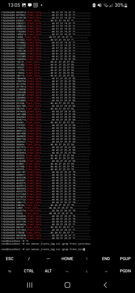
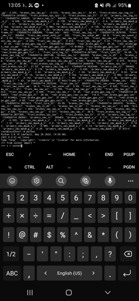
    Error codes are useful live, but fault histories are gold when you analyze logs later.

Even with those limitations, this first system proved the point: a dashboard becomes dramatically more usable when it can explain its own failures.


Designing a Software Dashboard

At this stage of the project, I had already built a working sensor network and a data logging system that could receive, parse, and store data from multiple onboard modules. The next logical step was to make that data visible in real time.

This meant designing and building a dashboard—not just a visual interface, but a system that could consume fused sensor data and present only what actually mattered to the rider.


Backend Data Fusion and Frontend

One of the first design decisions I made was to separate responsibilities:

  • the backend would collect, parse, and fuse sensor data
  • the frontend would request that data and render it

The data logging engine was already:

  • receiving sensor data wirelessly
  • parsing incoming packets
  • storing logs in JSONL format

What was missing was a real-time access layer for the dashboard.


Exposing fused data over UDP

To solve this, I added a dedicated UDP socket to the data logging engine.

This socket had a very specific role:

  • expose the current fused data frame
  • allow any client to request that data on demand

The logic was intentionally simple:

  • a client sends a REQ message
  • the logging engine responds with one aggregated data frame
  • the frame contains the latest values from all active sensors

This same port could be used by:

  • the dashboard frontend
  • a laptop for debugging
  • a Jupyter Notebook session

I chose UDP over TCP because it is connectionless. There’s no session state to manage, and clients can connect or disconnect freely without additional logic. For stateless, on-demand data streaming, UDP was a better fit.


Conceptualizing , Design and Implementation

Before writing any dashboard code, I needed to answer a harder question:

What should the dashboard actually show?

A dashboard can look impressive and still be unusable in practice. A visually “cool” dashboard is not automatically a practical one.

The rider needs to:

  • understand information at a glance
  • avoid distraction
  • see the most important signals clearly

This meant resisting the temptation to display everything.


Drawing Ideas and Inspiration

To ground my design decisions, I studied dashboards from several manufacturers:

The BMW S1000RR dashboard stood out in particular. Its layout felt balanced, readable, and intentional. Information was grouped logically, colors were restrained, and nothing felt oversized or cluttered.

It became a strong reference point for what good dashboard design looks like.


Sketching and planning the dashboard layout

With references in mind, I started sketching dashboard layouts.

At this stage, the goal wasn’t aesthetics—it was information hierarchy:

  • what needs to be central
  • what can be secondary
  • what can be hidden entirely

I sketched widget placements and experimented with different layouts before committing to any implementation.


Deciding what information actually mattered

Once I had real sensor data flowing, I made a list of everything I could display—and then cut it down.

Some data was better suited for logging and offline analysis rather than real-time display.

The core information that stayed on the dashboard was:

  • speed
  • RPM
  • gear indicator
  • date and time

On top of that, I added:

  • tyre temperature indicators
  • brake disc temperature indicators
  • suspension level indicators
  • lap timer

Anything that didn’t clearly help the rider in the moment was removed.


Feature Addition & Substraction

Not everything survived testing.

Some features that were implemented and later removed:

  • a shift indicator widget
  • early, low-resolution suspension indicators
  • a startup “sweep test” animation

The sweep animation looked cool, but:

  • it didn’t add functional value
  • it introduced unnecessary rendering load
  • it caused visible UI jank

This was an important lesson: visual effects can hurt usability and performance.


Managing information density and cognitive load

As the dashboard matured, I added:

  • headlight indicators
  • GPS lock status
  • lap mode indicator
  • custom sensor error codes

These error codes were not Suzuki ECU errors, but internal diagnostics so I could see which sensor modules were offline or misbehaving.

One important design decision involved lap mode:

  • when lap mode is active, the clock is hidden
  • when lap mode is disabled, the clock returns

This prevented two time-based widgets from competing for attention.


Iteration taught restraint

Over time, the dashboard became simpler.

Elements that felt important early on were removed after real usage. Each iteration forced a question:

Does this actually help the rider right now?

If the answer was no, it didn’t belong on the screen.

Balancing:

  • imagination
  • integration
  • restraint

turned out to be one of the hardest parts of the project.


Why this mattered for an older bike

What made this especially satisfying was seeing the dashboard running on a 2003 GSX-R1000.

This bike was never designed to support:

  • telemetry
  • modern dashboards
  • software-driven behavior

Yet with a layered system—sensors, backend fusion, frontend display—it was possible to give it a modern, data-driven interface without touching the ECU.


What this part of the project taught me

Designing the dashboard taught me that:

  • presentation matters as much as data
  • fewer signals, shown well, beat many signals shown poorly
  • dashboards should be opinionated
  • integration is as much a design problem as a technical one

It also gave me a new appreciation for how much invisible engineering goes into OEM motorcycle dashboards.

Experimenting with Speed Sensors

One of the parameters I wanted to integrate into the data logging system was speed.

Speed feels like one of the simplest signals you can measure. It’s just how fast you’re moving, right? On the surface, it sounds trivial: count wheel rotations, do some math, and you’re done.

As it turns out, speed sensing is one of those subsystems that looks simple only because OEM systems have already solved it extremely well.


How motorcycles normally measure speed

I first became curious about speed sensing when I was working on my clutch cable.

To access it, I had to remove the front sprocket cover on the engine side. Inside, I noticed a metallic ring with evenly spaced teeth, and a sensor positioned very close to it without touching.

Most motorcycles measure speed using:

  • a toothed tone ring (or reluctor ring)
  • a Hall-effect or variable reluctance sensor

As the ring rotates, each tooth passing the sensor generates a pulse. The ECU counts these pulses over time and converts them into wheel speed. That speed is then used for:


My initial plan: count wheel rotations

My idea was straightforward:

  1. detect each wheel rotation
  2. count pulses
  3. use basic geometry to compute speed

In theory:

  • wheel circumference = (2\pi r)
  • rotations per second → speed

That part wasn’t wrong.

What I underestimated was how hard it is to get clean, reliable pulses on a real motorcycle.


First attempt: IR reflection sensing (and why it failed)

My first approach didn’t even use a Hall-effect sensor.

Instead, I tried an optical method:

  • attach a reflective strip to the rear wheel
  • shine light toward it
  • detect the reflection with an IR sensor

I didn’t have an IR LED at the time, so I used a white LED instead (which does emit some infrared).

On the bench, it worked.
At low speed, rolling the bike slowly, it worked.

But once the bike was moving fast—especially above ~120–160 km/h—the system completely fell apart.

Symptoms included:

  • wildly high speed readings
  • random zero values
  • unstable pulse timing

Daylight made it even worse. Sunlight floods the sensor with infrared radiation, completely overwhelming the signal.

This approach simply wasn’t viable outside a controlled environment.


Second attempt: Hall-effect sensor and magnet

After abandoning optical sensing, I switched to a Hall-effect sensor, which is much closer to how OEM systems work.

The setup was:

  • a small magnet attached to the rear wheel
  • a Hall-effect sensor fixed near the wheel
  • each pass of the magnet generated a pulse

Bench tests worked.
Slow-speed tests worked.
Rolling the bike by hand worked.

But once again, under real riding conditions, the readings became unreliable at higher speeds.


Why the Hall-effect setup still struggled

At first glance, this didn’t make sense.

A microcontroller can easily process signals faster than a wheel can spin, so why was the data still wrong?

Several issues were likely at play:

1. Sensor limitations

Not all Hall-effect sensors are designed for:

  • high-frequency pulse detection
  • vibration-heavy environments
  • automotive EMI conditions

I was pushing a cheap sensor far outside its comfort zone.

2. Mechanical vibration

At speed, vibration introduces:

  • signal jitter
  • timing instability
  • false triggering

Even slight movement of the sensor or magnet can cause extra pulses.

3. Electrical noise

Motorcycles are electrically noisy environments:

  • ignition systems
  • charging systems
  • long wire runs

Without proper shielding and filtering, noise easily couples into digital inputs.


The software side is harder than “count pulses”

Another misconception I had was thinking that speed calculation was just geometry.

In reality, the software needs to:

  • debounce pulses
  • reject impossible timing values
  • smooth sudden spikes
  • handle missed pulses gracefully

If you don’t do this, you get:

  • momentary speed jumps
  • sudden drops to zero
  • unstable readings

OEM systems spend a lot of effort making sure speed data is trustworthy, not just mathematically correct.


Why OEM speed sensing works so well

This experiment gave me a new appreciation for automotive sensors.

OEM speed sensors:

  • are designed for extreme vibration
  • tolerate heat and moisture
  • use precise tone rings
  • are calibrated for specific wheel speeds
  • include robust signal conditioning

They need to work nearly 100% of the time, because incorrect speed data can break:

  • traction control
  • ABS logic
  • stability systems

Something as simple as speed becomes a safety-critical signal.


Accepting reality: using GPS for speed

After multiple attempts with IR and Hall-effect sensing, I had to accept that my setup wasn’t reliable enough.

So I fell back to GPS-based speed.

GPS speed has drawbacks:

  • slow update rate
  • lag during acceleration
  • poor accuracy at very low speeds

It wasn’t perfect, but it was consistent.


Lessons Learnt

Trying to measure speed taught me more than I expected.

I learned that:

  • “simple” signals often aren’t simple
  • sensors must be matched to their environment
  • signal conditioning is just as important as hardware
  • OEM systems earn their reliability

Most importantly, it showed how much engineering hides behind things we take completely for granted.


My Conclusion

Even though I didn’t match OEM performance, this wasn’t a failure.

It exposed:

  • mechanical challenges
  • electrical noise issues
  • software filtering requirements

And it reinforced the idea that building reliable systems is very different from building prototypes.

IMUs & Motion: Limits and Challenges

This part of the project didn’t “work” in the way I originally expected. I wasn’t able to extract clean, stable orientation or lean angle data from the IMUs.

One of the things I’ve always found fascinating about modern super-bikes is how deeply they rely on spatial sensing.

Today, bikes come equipped with IMUs (Inertial Measurement Units) that continuously measure how the bike is accelerating and rotating in three-dimensional space. This data is what enables systems like traction control, wheelie control, and cornering ABS to work the way they do.

On bikes like the BMW S1000RR, Yamaha R1M, or Ducati V4R, IMUs are a core part of the electronics stack.

I wanted to explore the same idea—but strictly for logging and observation.


What an IMU actually measures (and what it doesn’t)

An IMU typically contains:

  • a 3-axis accelerometer
  • a 3-axis gyroscope
  • sometimes a magnetometer (not always)

Together, these sensors measure:

  • linear acceleration along X, Y, and Z axes
  • angular velocity (rotation rate) around X, Y, and Z axes

What an IMU does not directly measure is:

  • absolute orientation
  • lean angle
  • pitch or yaw as stable angles

Those values must be computed from raw sensor data using math and filtering.

This distinction turned out to be very important.


My initial IMU plan

My original idea was to place multiple IMUs across the bike to see how different sections experience motion.

The plan was:

  • one IMU in the front section
  • one IMU in the mid section
  • one IMU in the rear section

Each IMU would:

  • have its own microcontroller
  • stream data wirelessly to the logging system

The goal wasn’t sensor fusion between IMUs—it was comparison and observation.


Hardware choice: MPU6050 (and why)

I used the MPU6050 IMU module.

This wasn’t because it was ideal, but because:

  • it was available
  • it’s cheap
  • it’s widely documented
  • it integrates easily over I²C

The MPU6050 includes:

  • a 3-axis accelerometer
  • a 3-axis gyroscope
  • no magnetometer

That last point matters a lot.


How the IMUs were distributed

To reduce controller sprawl, IMUs were grouped logically:

  • Front section:
    • one MPU6050
    • shared controller with the front suspension ultrasonic sensor
  • Mid section:
    • two MPU6050 sensors on one controller
    • added mainly for redundancy and comparison
  • Rear section:
    • one MPU6050
    • integrated into the rear brake input module

This wasn’t perfect architecture, but it kept controller count manageable and wiring tidy.


First reality check: raw IMU data is not orientation

After test runs, I quickly realized I had misunderstood something fundamental.

I initially assumed that an IMU like the MPU6050 could directly give me:

  • lean angle
  • pitch
  • roll

That’s not how it works.

Accelerometer data

The accelerometer measures specific force, not orientation. At rest, this appears as approximately ±1g depending on axis orientation. During motion, acceleration from braking, bumps, and vibration completely dominates gravity.

You can multiply the normalized readings by g to get acceleration in m/s², but that doesn’t magically give orientation.

Gyroscope data

The gyroscope measures angular velocity, not angle. To get orientation, you must integrate angular velocity over time—and integration drifts.

Without correction, drift grows quickly.


Why orientation estimation is hard

To compute stable orientation (roll, pitch, yaw), you need:

  • gyroscope integration (fast, but drifts)
  • accelerometer reference (noisy during motion)
  • magnetometer reference (for yaw correction)

The MPU6050 lacks a magnetometer, which means:

  • yaw cannot be stabilized
  • long-term orientation drifts are unavoidable

This is why OEM IMUs:

  • are carefully calibrated
  • use high-grade sensors
  • rely on sophisticated sensor fusion algorithms


Mounting matters more than expected

Another thing that became obvious very quickly: IMU mounting is critical.

Poor mounting leads to:

  • vibration-induced noise
  • resonance artifacts
  • axis misalignment

Even small flex or movement in the mount can dominate the signal. This made it very difficult to extract meaningful insight from raw data.

At this stage, the IMUs were doing what they were supposed to do—but interpreting the data meaningfully was a different problem entirely.


Trying lean angle using Android’s Rotation Vector

To get something usable, I experimented with lean angle estimation using the Android Rotation Vector sensor.

Important clarification:

  • The Android Rotation Vector is not a physical sensor
  • It is a virtual sensor created by sensor fusion
  • It combines:
    • accelerometer
    • gyroscope
    • magnetometer (on the phone)

When the bike was stationary, this worked reasonably well. Lean angle readings looked correct.

But once the bike was in motion—especially at higher speeds—the readings became wildly inaccurate. Lean angle would drift by tens of degrees.


Why the Android sensor drifts so badly on a bike

This wasn’t a bug. It was a design limitation.

Android’s sensor fusion algorithms are designed for:

  • phones in pockets
  • phones in hands
  • walking, running, casual movement

They are not designed for:

  • high vibration
  • sustained acceleration
  • aggressive rotation
  • a device rigidly mounted to a motorcycle at speed

At high speeds, accelerometer data is dominated by dynamic forces, confusing the gravity reference. The fusion algorithm loses its frame of reference and orientation drifts badly.

This made it clear why OEM systems do not rely on general-purpose phone sensors.


What I learned from the IMU experiments

Even though the data was noisy and hard to interpret, this experiment was extremely valuable.

I learned that:

  • IMUs do not give angles “for free”
  • orientation requires careful fusion and filtering
  • sensor grade matters
  • mounting quality matters
  • math matters a lot

It also gave me a new appreciation for how complex systems like traction control really are. They don’t just “read lean angle”—they estimate it under brutal conditions.


Why I kept the IMUs anyway

Despite the limitations, I kept the IMU data.

Why?

  • relative motion trends were still visible
  • spikes during braking and acceleration were clear
  • vibration signatures were interesting
  • it exposed the real challenges of spatial sensing

Even noisy data can teach you something—especially when you understand why it’s noisy.


What I learnt from this

Implementing spatial sensing—even just for logging—forced me to confront:

  • sensor physics
  • signal processing
  • data fusion
  • real-world noise

It made it clear why IMU-based intervention systems take years of development and testing.

The GXXR Dashboard

Once I could reliably log sensor data, store it, export it, and analyze it using tools like Pandas, it felt like the right time to take the next step.

Looking at plots after a ride was useful—but it was also disconnected from the riding experience itself. I wanted to be able to see some of the data live, while riding, in a way that actually made sense.

That naturally led to the idea of building an instrument cluster, or dashboard.


Why I wanted a dashboard in the first place

The goal of the dashboard wasn’t to show everything.

Some parameters were:

  • Too noisy
  • Too complex
  • Better suited for offline analysis

Those would stay in the background and simply be logged.

The dashboard needed to surface only the most useful, rider-relevant information, without overwhelming the user.

That meant thinking not just like an engineer, but like a rider.


Looking for design inspiration

Before writing any code, I spent time looking at existing dashboard designs.

I downloaded images of:

  • Modern superbike dashboards
  • TFT instrument clusters
  • Racing dashboards and telemetry screens

At the same time, I sketched a few ideas of my own to explore layout and hierarchy.

One design kept standing out: the 2025 BMW S1000RR dashboard.

It uses:

  • A large TFT display
  • A clean, high-contrast color scheme
  • Clear prioritization of information
  • Visual elements instead of raw numbers where possible

It gives the rider what they need—without shouting.

That made it a great reference point.


Constraints of my platform

The S1000RR dashboard is a dedicated hardware unit, deeply integrated into the bike’s electronics via CAN bus. My setup was very different.

  • No CAN bus
  • No factory ECU integration
  • Wireless sensor system
  • Prototype-level hardware

I didn’t want to build a physical dashboard unit at this stage. Instead, I decided to use something I already had: a smartphone.


Using a smartphone as the dashboard hardware

I chose to run the dashboard on an Android smartphone (Samsung Galaxy M31).

That decision came with some advantages:

  • High-resolution display
  • Touch input
  • Built-in power management
  • Easy deployment and iteration

It also meant the dashboard had to be implemented as a native Android app.

Since I already had experience with Android Studio, this felt like the most practical path forward.


Designing the UI with Figma

Before writing any Android code, I focused on the UI.

I developed some of the assets for the dashboard UI in Figma which I used to:

  • Design individual widgets
  • Experiment with layout
  • Adjust spacing and hierarchy
  • Think about how information flows visually

This made a huge difference. Being able to design visually first helped avoid a lot of trial-and-error later in code.

I wasn’t trying to copy the S1000RR dashboard, but I was trying to understand why it works.

One key lesson was restraint:

A good dashboard doesn’t show everything—it shows the right things.


Choosing what to display (and what not to)

After some iteration, I settled on displaying:

  • Tyre temperature parameters
  • Brake disc temperature parameters
  • RPM
  • Speed
  • Suspension state
  • Gear indicator
  • Lap timer
  • Clock
  • Brake usage indicators
  • Sensor error codes (for my system, not the bike ECU)

Anything that didn’t directly help the rider stayed out of view and was only logged in the background.


Custom widgets and visual elements

Many of the UI elements needed to be custom.

For example:

  • RPM required an arc-style widget that changed width dynamically
  • Temperature values worked better as bars rather than raw numbers
  • Suspension state needed a visual indicator instead of a static value

Some early versions used static images to represent suspension movement, but that didn’t feel right. I wanted elements that moved and responded.

This pushed me deeper into custom widget design.


Connecting the dashboard to the data logger

The dashboard didn’t talk directly to sensor modules. Instead, it communicated with the data logging engine.

The data logging engine:

  • Ran as a Python program
  • Collected and logged all sensor data
  • Exposed a UDP server on port 9100

The protocol was simple:

  • The dashboard (or any UDP client) sends a "REQ" message
  • The logger responds with a single, aggregated data frame
  • The dashboard parses the frame and updates the UI

This design had a few advantages:

  • Loose coupling between systems
  • Easy debugging from a laptop or another device
  • One unified data snapshot per request


Software gating and lap timer logic

One of the more interesting problems was implementing a lap timer without adding new hardware controls.

Instead of building a dedicated control module, I reused existing inputs:

  • Front brake signal
  • Rear brake signal
  • Pass light trigger

The logic worked like this:

  • Press both brakes → countdown begins
  • After countdown → dashboard enters lap mode
  • Front brake + pass light → start lap
  • Rear brake + pass light → stop lap

Using the pass light prevented accidental triggering during normal riding.

This kind of software gating turned out to be surprisingly powerful. It allowed fairly complex behavior using very simple inputs.


Handling sensor errors

Another dashboard feature I added was sensor error reporting.

If a sensor failed or stopped reporting, the dashboard could show:

  • Which module was affected
  • That something was wrong

This made diagnosing issues much easier, especially during test rides.


Learning restraint in dashboard design

As the dashboard evolved, I started removing things.

At one point, I even had a GSX-R logo on the screen—but over time it felt like clutter. It didn’t help the rider, so it had to go.

This process reinforced a key lesson:

If a UI element doesn’t help in the moment, it doesn’t belong on the dashboard.

That philosophy clearly came from studying well-designed OEM dashboards like the S1000RR.


Frontend and backend on the same device

In the final setup:

  • The data logging engine ran as a backend Python process
  • The dashboard ran as a foreground Android app
  • Both lived on the same device

Structurally, it wasn’t that different from a typical software system:

  • Backend collects and serves data
  • Frontend renders it for the user

The difference was that the “backend” was talking to real hardware mounted on a motorcycle.


Why the dashboard mattered

Building the dashboard changed how the project felt.

It turned:

  • Abstract plots into real-time feedback
  • Logged data into actionable awareness
  • A sensor experiment into something closer to a real system

It also made clear just how much thought goes into human-machine interfaces on modern motorcycles.

First Sensor Data Log Test Run

At this point in the project, most of the sensors were finally in place.

That included:

  • Brake disc temperature sensors
  • Tyre temperature sensors
  • GPS data from the rear section
  • Suspension movement using ultrasonic ranging
  • Engine coolant temperature
  • Input sensing from the front brake, rear brake, and headlight switch

With all of that hardware installed and communicating, it was finally time to answer a simple question:

What does the data actually look like when you ride the bike?


How the system was powered and networked

Before getting into the data itself, it’s important to explain how everything was running during the test ride, because this setup played a big role in how stable the system turned out to be.

All sensor modules were powered from a single 5V power rail, supplied by a separate power bank. This was a deliberate design choice. I wanted the entire sensing and logging system to be electrically isolated from the bike’s main electrical system.

That isolation had a few advantages:

  • No risk of interfering with the bike’s ECU or wiring
  • Reduced electrical noise from the bike
  • Easier debugging when something went wrong

Once the power bank was switched on, all sensor modules booted automatically.

Because the system was fully wireless:

  • My phone acted as a WiFi hotspot
  • The phone was also running the data logging engine
  • All sensor modules connected directly to the phone

This effectively turned the phone into the central hub of the system, handling networking, data collection, and storage at the same time.


In practice, this setup worked surprisingly well. All sensors were within range of the phone, and I never experienced WiFi dropouts during the ride. Every module stayed connected and streamed data continuously.

Looking back, isolating power and keeping networking simple probably saved me from a lot of intermittent and hard-to-debug problems.


The first real data logging run

The first test run itself wasn’t anything extreme. It was simply a ride from home to my workplace under normal riding conditions.

At the time, I wasn’t entirely sure how I would handle the data once it came in. I had already written multiple versions of a Python-based logging engine, and the earlier versions stored data in CSV format.

That’s what I used for the first run.

The ride went smoothly. The sensors logged. The system didn’t crash.

Then I opened the data file.


Realizing the data was too large to handle locally

The CSV file was massive.

There was no realistic way to:

  • Scroll through it comfortably
  • Inspect it manually
  • Make sense of it directly on my laptop

That’s when I started thinking about moving the analysis somewhere with more computing power.

The obvious answer was the cloud.


A quick and messy data pipeline (that still worked)

The workflow I came up with wasn’t elegant, but it got the job done:

  1. Convert the CSV data into JSON
  2. Upload the converted data to Firebase
  3. Load the data into Google Colab
  4. Explore and visualize it using Python

I honestly don’t remember why Firebase was the first thing that came to mind, but it worked.

The downside was obvious:

  • Conversion took time
  • Uploading the large dataset was slow
  • The workflow felt fragile and unsustainable

Still, once the data was available in Google Colab, I could start exploring.


Seeing the data for the first time

This was the moment where everything started to feel real.

Inside Google Colab, I loaded the dataset and began plotting different signals:

  • Brake disc temperature over time
  • Suspension movement during braking
  • Responses during acceleration
  • General trends across the ride

Nothing fancy—mostly basic plotting using pandas and matplotlib, tools I had only lightly touched back in college.

But seeing data generated by hardware I built, from a bike I rode, plotted in front of me was incredibly satisfying.


Discovering a major flaw: time synchronization

As exciting as it was, something didn’t look right.

I noticed that:

  • Different sensors produced different numbers of data frames
  • Some data streams were much denser than others
  • Events didn’t line up cleanly across sensors

Up until this point, I had made a bad assumption.

I assumed that because all sensor modules booted at roughly the same time, their data would naturally be synchronized.

That wasn’t true.

Some modules:

  • Ran faster loops
  • Had more processing overhead
  • Sent data at different rates

There was no shared clock.


Rethinking the logging approach

This forced me to rethink how the logging engine worked.

Two ideas came up:

Time-slot based logging

Instead of logging whenever data arrived, I could:

  • Define a fixed time window (for example, once per second)
  • Sample the latest values from all sensors
  • Store them together as a single frame

This would force alignment.

Switching to JSONL

Instead of CSV → JSON conversion, I could:

  • Log directly as JSON Lines (JSONL)
  • Append one structured record per time slot
  • Upload a single file
  • Load it directly into Google Colab

We tried this approach—and it worked far better.


When everything finally lined up

Once the data was time-aligned, everything clicked.

Now I could clearly see:

  • Brake input events
  • Immediate suspension response
  • Brake disc temperature rising
  • Tyre temperature reacting more slowly

I could brake hard and watch the system respond:

  • Brake signal toggled
  • Suspension compressed
  • Brake disc temperature climbed

These are some the plots from when I was looking at the data in segments like I could plot the temperature data or IMU data. There is also a brake input plot which are just binary , 1 for when the brake is not engaged and 0 for when the brake is engaged.


Learning the limits of the data

One thing became clear quickly: some runs were simply too short.

Tyre temperature, in particular, doesn’t change much unless:

  • You ride longer
  • You push harder
  • You sustain load

That was fine. This wasn’t about perfect results. It was about understanding what mattered and what didn’t.

This test run was a turning point.

For the first time, the entire loop worked:

  • Hardware → data logging
  • Data logging → cloud analysis
  • Analysis → insight

Even with a messy pipeline and imperfect sensors, the system worked.

I could build hardware, ride the bike, record data, and understand what was happening.

That alone made the project feel worth it.

Logging GPS and Brake Inputs

By the time I had several sensors working reliably, I started to realize something slightly ironic:
even though I was already capturing a lot of data, I actually needed more parameters.

Not because the project wasn’t complex enough already—but because the data I had didn’t always explain why things were happening.

That realization pushed me to focus more heavily on the rear section of the bike.


Why the rear section became the focus

The rear section made sense as a place to expand for a few reasons:

  • There was physical space to mount additional electronics
  • It already hosted temperature sensors
  • It was a logical place to integrate GPS and brake-related data
  • It could act as a “hub” for several related measurements

Instead of scattering more single-purpose modules everywhere, I wanted to experiment with grouping functionality.


Designing a more modular rear electronics unit

The first new rear module I planned needed to do several things:

  • Monitor rear brake disc temperature
  • Integrate a GPS module
  • Allow for future expansion (including a possible speed sensor)
  • Be detachable and reprogrammable
  • Use connectors rather than hard-wired connections

In my head, this module started to resemble a very crude version of an ECU-style unit—not in function, but in philosophy. Something you could unplug, reflash, and reinstall without disturbing the rest of the system.


Adding brake signal monitoring

The second rear module focused on brake signal monitoring.

What I wanted here was simple but important:

  • Detect front brake activation
  • Detect rear brake activation

This module used:

  • An ESP8266 controller
  • Two 12V relays connected to the brake light circuits
  • Logic-level outputs (1 or 0)

There was no brake pressure sensing, no analog finesse—just a clean digital signal telling me when braking occurred.

That alone was extremely valuable.

By having brake inputs, I could now correlate:

  • Braking events
  • Suspension dive
  • Brake disc temperature rise
  • Tyre temperature changes


Adding an IMU to the rear section

While working on the brake signal module, I also decided to integrate an MPU6050 IMU into the rear section.

The idea was to:

  • Capture motion data closer to the rear of the bike
  • Compare it with IMU data from the front or mid section
  • See how different parts of the bike experience movement differently

This wasn’t about sensor fusion yet—it was about observing differences.


GPS integration (simple, but useful)

For GPS, I kept things intentionally basic.

I used a u-blox NEO-6M GPS module, which is:

  • Cheap
  • Widely available
  • Easy to integrate
  • Relatively slow in refresh rate

I knew upfront that the refresh rate would be limited, so this wasn’t going to give me high-resolution speed or position data. But it still had value:

  • Location context
  • Rough speed reference
  • Time alignment with other data streams

To mount it, I designed a small rear wing that kept the GPS module exposed. It also happened to look kind of cool, which was a bonus.


Keeping communication consistent

Just like the other sensor units, these rear modules:

  • Used ESP8266 controllers (Wemos D1 form factor)
  • Connected wirelessly to the sensor network
  • Sent data to the central logging system

By keeping the communication model consistent, integration was straightforward. New modules could come online without major changes to the rest of the system.


The ESP8266 everywhere problem

At this point, almost everything was using an ESP8266—and that was both good and bad.

On the plus side:

  • Small footprint
  • Easy to program
  • Built-in WiFi
  • Cheap and replaceable

On the downside, I started to notice something worrying.

I had:

  • A dedicated front brake disc sensor controller
  • A dedicated front IMU and suspension controller
  • A dedicated engine coolant and pass-light trigger module
  • Multiple rear modules

Just in the front section alone, I was already running three separate microcontrollers.

The system was working, but the module count was exploding.


Realizing the need for consolidation

This rear-section experiment taught me an important lesson:

You can make many small, dedicated modules—but complexity grows fast.

In an ideal world, I would have:

  • One larger module per section
  • Multiple sensor connectors per module
  • Fewer microcontrollers
  • Cleaner wiring
  • More uniform design

But there was a trade-off.

If I stopped to redesign everything properly, I would risk falling into analysis paralysis.

Monitoring Suspension using Ultrasound

After working through temperature sensing and system architecture, the next area I wanted to explore was suspension behavior.

Modern superbikes equipped with electronic suspension systems—such as dynamically damped suspension—can actively adjust and monitor suspension in real time. My bike doesn’t have any of that. It runs a standard mechanical suspension with no electronics involved.

That didn’t mean the suspension wasn’t doing interesting things. It just meant I couldn’t see them.

So the goal here wasn’t control or tuning. It was observation.


What I wanted to learn from the suspension

I was interested in understanding how the suspension behaves in everyday riding conditions:

  • How much does it compress under hard braking?
  • What happens during acceleration?
  • How does it behave during steady cruising?
  • How does rough road surface affect movement?

In short, I wanted to monitor compression and rebound, not intervene or adjust anything.


Why I avoided mechanical measurement

The most direct way to measure suspension travel is with mechanical linkages or linear position sensors. I ruled that out very early.

Mechanical setups:

  • Add complexity
  • Require precise mounting
  • Can interfere with moving parts
  • Are fragile in a vibration-heavy environment

I wanted something non-contact, simple, and safe to experiment with.

That’s what led me to ultrasonic distance sensors.


How ultrasonic ranging works (simple explanation)

Ultrasonic ranging is based on a very straightforward idea.

An ultrasonic sensor:

  1. Emits a short burst of high-frequency sound (ultrasound)
  2. That sound travels through the air until it hits an object
  3. The sound reflects back to the sensor
  4. The sensor measures how long the echo takes to return

Because the speed of sound in air is known, the distance can be estimated using time-of-flight:

Distance = (time × speed of sound) / 2

The division by two accounts for the sound traveling to the object and back.


In this project:

  • The sensor was mounted to the bike frame
  • The reflecting object was the wheel or tire
  • Changes in distance corresponded to suspension movement

As the suspension compresses or extends, the measured distance changes.


Why ultrasonic sensors made sense for this project

Ultrasonic sensors aren’t precision instruments, but they have a few advantages that made them ideal here:

  • Completely non-contact
  • Cheap and easy to replace
  • Simple to interface with microcontrollers
  • Fast enough to capture suspension movement trends

Most importantly, they let me observe relative movement, which was the real goal.


Sensor placement on the bike

I installed:

  • One ultrasonic sensor at the rear
  • One ultrasonic sensor at the front

Each sensor was positioned so it faced the wheel directly, measuring the gap between the wheel and a fixed point on the bike.

As the suspension moved:

  • Compression reduced the distance
  • Rebound increased the distance

What surprised me was how quickly this worked. Once mounted and powered, the sensors immediately started reporting meaningful changes.


What I was measuring (and what I wasn’t)

Technically, you can calculate real suspension travel by:

  • Recording a baseline distance
  • Tracking changes from that baseline
  • Converting distance changes into displacement values

I chose not to do that.

Accuracy wasn’t the objective here. I wasn’t aiming for millimeter-perfect measurements or shock dyno data. What I wanted was behavioral insight:

  • Relative compression vs extension
  • Fast vs slow movement
  • Smooth vs chaotic response

Seeing patterns mattered more than absolute numbers.


Visualizing suspension movement

Once data started coming in, plotting it made the behaviour obvious:

  • Sharp spikes during hard braking
  • Gradual compression during acceleration
  • Continuous small oscillations on rough roads

Even without exact units, the shape of the data told a clear story.


Considering laser distance sensors

I did consider using laser ranging sensors instead of ultrasonic ones.

Laser sensors offer:

  • Higher precision
  • Faster response
  • More focused measurement beams

But they’re also much more expensive. For a learning-focused, experimental setup, ultrasonic sensors struck the right balance.


Dealing with jitter and noisy data

One of the first issues I ran into was jitter.

The distance readings fluctuated significantly because:

  • The sensors updated very frequently (milliseconds)
  • The environment was mechanically noisy
  • The wheel surface wasn’t perfectly uniform

This wasn’t a hardware problem—it was a data problem.

Simple filtering on the software side helped smooth the signal and made the suspension behaviour much easier to interpret.


What this experiment taught me

Using ultrasonic sensors to monitor suspension movement wasn’t perfect, but it was extremely informative.

Key takeaways:

  • You don’t need high accuracy to gain insight
  • Non-contact sensing simplifies experimentation
  • Relative measurements are often enough
  • Simple sensors can reveal complex behaviour

GXXR System Architecture

After getting a few sensors working individually, it became clear that I couldn’t keep treating them as isolated experiments. If this project was going to grow beyond a handful of wires and test scripts, I needed some kind of system architecture—something that would bring order, make debugging easier, and allow me to add more sensors without everything turning into a mess.

At this point, the goal wasn’t elegance or OEM-level design. It was structure and scalability, even if the hardware itself was still very prototype-grade.


Breaking the bike into logical zones

The first decision I made was to stop thinking about the bike as one big system and instead break it down into three physical sections:

  • Rear section
  • Mid section
  • Front section

This immediately simplified how I thought about sensors, wiring, and future expansion.


Rear section

The rear section already had a few components in place:

  • Rear tire temperature sensors
  • Rear brake disc temperature sensor

I also knew this area would likely grow later, so I wanted the architecture to allow additional sensors without major changes.

Each rear module was treated as its own unit, responsible only for collecting data and sending it out wirelessly.


Mid section

The mid section was where I planned to add spatial awareness.

The idea here was a simple IMU unit consisting of:

  • One ESP8266 microcontroller
  • Two MPU6050 IMU sensors

This wasn’t high-end hardware by any means. Everything I was using at this stage was prototype-level, hobbyist gear. But that was fine. The point was to understand the problems first before worrying about precision or robustness.

This mid-section IMU would eventually help describe how the bike was moving, leaning, and accelerating in space.


Front section

The front section already had working modules:

  • Front tire temperature sensors
  • Front brake disc temperature sensors

Just like the rear, this section was designed with future expansion in mind. The important part was that each module behaved consistently, regardless of where it lived on the bike.


A wireless-first approach

One design choice that stayed consistent across all sections was wireless communication.

Every sensor module sent its data wirelessly to a central data logging system. This immediately removed a lot of complexity:

  • No long signal wires running across the bike
  • No shared buses stretched through noisy environments
  • Easier isolation and debugging

Each module focused on one job:

  1. Read sensors
  2. Package data
  3. Transmit it

Everything else happened elsewhere.


First full system power-up

The first time I powered everything on together was genuinely interesting. Data started flowing in from multiple places on the bike, all at once.

At that moment, the system worked—but it also raised new questions.

The biggest one was data storage.


Deciding how to store the data

Each sensor module was already sending its readings in JSON format. That made debugging easy and human-readable, but it also made me think about performance.

Looking back, JSON may not have been the most efficient choice:

  • It’s text-based
  • It involves string operations
  • It’s slower than raw binary formats

But at the time, usability mattered more than speed.

I hadn’t yet decided whether the final data logs would be:

  • CSV files
  • JSON files
  • Or something else entirely

The key requirement was that the data had to be easy to analyze later using Jupyter Notebook or Google Colab. That decision would shape everything downstream, and it’s something I’ll cover in a separate article.


Early data logging and debugging

Before building a single “master” logging engine, I took a more pragmatic approach.

I wrote small Python programs that:

  • Listened on specific UDP ports
  • Received data from individual sensor modules
  • Printed or stored the incoming data

Each module sent its data to a dedicated port, which made debugging much easier. If something looked wrong, I could isolate that one stream without guessing.

The long-term plan was always to replace this with:

  • A central data logging engine
  • Multiple threads, each handling a module
  • A system that flattened all incoming data into a unified structure

But for early development, simple tools were enough.


Powering the system (on purpose, not accidentally)

One design decision I was very deliberate about was power isolation.

All sensor modules were powered from a single 5V rail, supplied by an external power bank. I could have used a 12V-to-5V converter and tied everything into the bike’s electrical system, but I chose not to.

The reason was simple:

  • I didn’t want experimental electronics touching the bike’s primary electrical system
  • I wanted failures to be contained
  • I wanted to debug without risking the bike itself

This separation gave me peace of mind while experimenting.


What this stage taught me

Designing the system architecture didn’t magically make everything easy, but it did make the complexity manageable.

A few things became clear:

  • Thinking in zones simplifies physical design
  • Treating each sensor as an independent module scales well
  • Early architecture matters, even for hobby projects
  • Debugging is much easier when data streams are isolated

This stage wasn’t about perfection. It was about creating a foundation solid enough to build on—and fragile enough to teach me where the real problems were.

Monitoring Brake Temperature

After getting the tire temperature sensor modules working, the next thing I wanted to measure was brake disc temperature. This felt like a natural next step. Braking is one of the most aggressive actions on a motorcycle, and I was curious to see how quickly heat builds up during real riding.

At first, this part of the project seemed like it would be straightforward.


Using the same sensors

For brake disc temperature, I reused the same non-contact infrared temperature sensors I had already used for tire temperature sensing. The advantage of these sensors is that they measure temperature by detecting infrared radiation from a surface, which means there’s no need for physical contact.

That immediately simplified things.
No drilling, no clamps on brake lines, no risk of interfering with braking hardware.

In theory, I just needed to point the sensors at the discs and read the temperature.


Front brake disc mounting

The first challenge was mounting. I needed to position the sensors so they were:

  • Facing the brake discs directly
  • At a reasonable angle
  • Stable under vibration

For the front brakes, this meant aiming one sensor at the front-left disc and another at the front-right disc. Getting the angle right mattered more than I initially expected. Small changes in alignment noticeably affected readings.

By this point in the project, I was also dealing with a familiar limitation.


The I2C address problem (again)

All the infrared sensors I had left used the same fixed I2C address (0x5A). That meant I couldn’t place both front brake sensors on the same I2C bus.

The solution was the same workaround I had used before:

  • One sensor on the hardware I2C bus
  • One sensor on a software-emulated I2C bus

It wasn’t elegant, but it worked. Once everything was wired up and programmed, I could read temperature data from both front brake discs reliably.


Rear brake disc sensing

The rear brake disc was much simpler. I only needed a single sensor, which meant I could use the hardware I2C bus without any address conflicts.

Mounting the rear sensor was easier as well, though I quickly noticed that sensor distance mattered. The further the sensor was from the disc, the slower and less responsive the temperature readings felt. In hindsight, I could have mounted it closer, but for an early version of the system, it was good enough.

Once mounted, I could clearly see surface temperature changes on the rear brake disc during riding.


Why non-contact sensing mattered

One of the biggest advantages of using infrared sensors here was that I could measure brake disc temperature without touching the disc at all.

The sensors picked up infrared radiation emitted by the metal surface, which meant:

  • No risk of interfering with braking
  • No heat damage to wiring
  • No moving parts to worry about

It wasn’t laboratory-grade measurement, but it was more than enough to show real trends—especially during hard braking.


Software stayed simple

By this stage, I had settled on a consistent software structure for all sensor modules. Each module followed the same basic pattern:

  • Read sensor data
  • Package it into a simple data format
  • Send it back over WiFi using UDP

The brake disc temperature modules reused the same approach. From the data logging side, nothing special was needed. The logging program simply listened for incoming packets and stored everything into a log file.

Because of this consistency, adding brake disc temperature sensing was relatively easy compared to earlier stages of the project.


What this stage confirmed

This part of the project reinforced a few important lessons:

  • Reusing a known sensor design saves time
  • Physical mounting and distance affect readings more than expected
  • Non-contact sensing is extremely useful on a motorcycle
  • Software simplicity becomes valuable as the system grows

Brake disc temperature sensing worked well enough to answer the questions I had, and it gave me confidence to keep expanding the system.

Monitoring Tyre Temperature

I started building sensors and see what would actually work on a real motorcycle. This part of the project involved a lot of fabrication, testing, programming, and trial-and-error. It was also where my assumptions about “simple sensors” started to break down.

I didn’t start with the most complex system. I picked something that felt measurable, visual, and useful: tire temperature.


Starting with rear tire temperature

The first module I worked on was the rear tire temperature unit. The idea was straightforward. I wanted to measure the temperature of the tire across three regions:

  • Left edge of the tire
  • Center of the tire
  • Right edge of the tire

To do this, I used three non-contact infrared temperature sensors (MLX90614). The plan was to connect all three sensors to a single microcontroller, read their values continuously, and stream the data back wirelessly.

At this stage, the goal wasn’t perfect accuracy. It was to answer a much simpler question:
Can I even collect usable temperature data from a moving motorcycle tire?


Choosing WiFi over wiring

One of the early design decisions was how these sensor modules would communicate. Running wires back to a central unit would have meant implementing a proper communication bus, something like CAN. That would have required extra hardware, more complexity, and more cost per module.

SPI or I2C over long runs also didn’t feel like a good idea. Those protocols are sensitive to noise and interference, especially in an environment full of vibration, heat, and electrical noise.

So I went with WiFi.

I was using an ESP8266-based NodeMCU, which already had WiFi built in. It wasn’t the most elegant solution, but it was available, cheap, and flexible. Each sensor module could be self-contained and transmit data independently.


Sending data with UDP broadcast

To keep things simple, I chose UDP for data transmission. Unlike TCP, UDP is connectionless, which meant I didn’t have to manage connections, retries, or handshakes. If a packet was lost, that was fine—I cared more about trends than perfect delivery.

I also decided to broadcast the data packets over the local network instead of sending them to a fixed IP address. That way, I didn’t have to hardcode destinations into the modules. Any listening program could receive the data.

To test this, I wrote a small Python script and also used tools like ncat to listen on the network. Seeing raw temperature values coming in over the network for the first time was genuinely exciting. It meant the concept worked.


Mounting challenges on the rear

Once the rear module was working electrically, I ran into a very physical problem: placement.

The bike didn’t have a rear tire hugger, which would have been ideal because the sensor could move with the wheel and maintain a consistent distance. Instead, I ended up mounting the module on the tail section, close to the tire.

It wasn’t perfect, but it was good enough for a first test. The module stayed in place, the sensors read values, and data continued streaming over WiFi. That was enough to move on.


Front tyre temperature module

The front tire temperature module followed a similar design: three infrared sensors measuring left, center, and right sections of the tire. This time, mounting was easier because the bike had a front tire hugger. That allowed for a more stable and consistent setup.

Electrically, though, this is where things started getting tricky.


The I2C address problem

The MLX90614 sensors communicate over I2C. Normally that’s not an issue, but these sensors come in different variants with fixed I2C addresses. Most of the sensors I had used the same default address (0x5A). If you try to put multiple devices with the same address on a single I2C bus, it simply doesn’t work.

Out of the batch I had, only two sensors used a different address (0x2A). But I needed three sensors per module.

The workaround was a bit of a hack.

I placed two sensors—one with address 0x5A and one with 0x2A—on the hardware I2C bus of the ESP8266. For the third sensor, I implemented a software I2C bus on different GPIO pins using a library.

This meant:

  • Two sensors on the hardware I2C bus
  • One sensor on a separate, software-emulated I2C bus

It wasn’t elegant, but it worked.


Multiple modules, multiple data streams

This is test run data plot of the front tyre and you can the temperature of the left-edge ,center and right edge section of the front tyre. I will explain in brief what was happening when this test drive happened. Basically when we started at 0450am to around 0500 the temperature the edges rises and then we see a sharp drop as this was a traffic stop and then it starts to rise again as we continue flactuating. What was interesting was how the edges got warmer than the center and this was a normal work commute not a track run.

With both the rear and front tire temperature modules working, I configured each module to transmit data on a different UDP port. This made it easier to route and process the data on the receiving side without mixing streams.

At this point, I had:

  • A rear tire temperature module sending data
  • A front tire temperature module sending data
  • Both broadcasting over WiFi using UDP
  • Real temperature readings coming in from a moving motorcycle

This was the first moment where the project felt real.


What this stage taught me

Building these first sensor modules taught me a few things very quickly:

  • Hardware constraints show up fast in the real world
  • “Simple” protocols like I2C can become limiting
  • Wireless communication simplifies wiring but introduces its own trade-offs
  • Physical mounting is just as important as electronics

Most importantly, it showed me that collecting data was possible—but also that every new sensor would come with its own set of problems.

Project-GXXR: How it started

I started riding motorcycles in 2024. Like a lot of people, I had always wanted a superbike, and eventually I ended up with a second-hand Suzuki GSX-R1000 from 2003. The bike itself has a lot going on, but my actual riding journey is probably a story for another time.

What matters here is that once I started riding the bike every day—commuting to work, running errands, and just spending time on it—my curiosity slowly shifted. I wasn’t just riding anymore. I was constantly wondering how a machine like this actually works as a system.


Seeing a motorcycle as a system

When you sit on a superbike, you’re sitting on wide tires, a stiff aluminum frame, an inline-four engine making well over 120 horsepower, serious suspension, and an ECU-controlled fuel injection system. Somehow, all of this works together smoothly enough to be usable on normal roads.

At some point it clicked for me that superbikes aren’t just fast motorcycles—they’re complex engineering systems.

If you look at how these bikes have evolved, the difference is massive. Early-2000s superbikes and modern flagship models feel like they belong to different eras. Modern bikes rely heavily on electronics and software: ride-by-wire throttles, multiple riding modes, traction control, wheelie control, cornering ABS, and layers of logic constantly working in the background.

That shift toward electronics is what really caught my attention.

Inspiration from modern bikes and racing

A big inspiration for this project came from MotoGP. From a technical perspective, MotoGP bikes are rolling laboratories. They generate huge amounts of data—suspension movement, tire behavior, braking forces, lean angle, acceleration—and engineers use that data to refine setups and strategy session by session.

Around the same time, I was also looking at modern road bikes like the Yamaha R1M, which come with built-in data logging features. That idea stuck with me. I didn’t need race-level telemetry, but I kept wondering what it would be like to have some visibility into what my own bike was doing.

That’s when the idea formed:
What if I tried to log data on an old GSX-R that was never designed for it?


BMW S1000RR Dashboard

The questions I couldn’t answer while riding

I already had a rough intuition for a lot of things:

  • Hard braking heats up the brake discs
  • Tires warm up as you ride
  • The front suspension compresses under braking
  • Different rider inputs interact with each other

But intuition isn’t the same as measurement.

I couldn’t actually see any of this happening. I couldn’t measure it. Everything was based on feel and assumptions.

What really happens to brake disc temperature during a hard stop?
How quickly do tires warm up on a normal commute?
How does suspension behavior change under real road conditions?

Those questions kept coming back, and eventually curiosity won.


Turning curiosity into a data logging experiment

I didn’t start with a polished design or a clear end goal. I started by writing down what I was curious about and what I wanted to observe:

  • Front and rear suspension behavior
  • Front and rear tire temperature
  • Front and rear brake disc temperature
  • Spatial data using IMU sensors (lean and movement)
  • Engine coolant temperature
  • Brake input states
  • Headlight state for logic and triggers
  • GPS location data

At one point I even considered reading throttle position, but I dropped that idea quickly. I was already getting overwhelmed, and I had to remind myself what this project actually was.

This wasn’t about building a product or doing anything “proper.”
It was a hobbyist experiment to see if something like this was possible—and how hard it would be in practice.

I expected things to break, and I was fine with that. Learning was the whole point.


Testing a Throttle Position Sensor module

The first reality check

What surprised me wasn’t that the project was difficult—I expected that.

What surprised me was how quickly simple ideas turned into complex problems. Sensors that worked perfectly on the bench behaved very differently once they were mounted on a vibrating, hot motorcycle. Mounting, wiring, noise, and real-world conditions mattered far more than I initially thought.

That was the first real lesson of this project.